cover-view
The cover-view component enables mini-program developers to overlay text views on top of native components to provide informative texts. You can customize the text view through CSS (Cascading Style Sheet) and add it to the following native components:
- map
- canvas
- video
- live-player
- lottie
Before you begin
Before implementing the cover-view component, consider the following guidelines:
- Verify support for the component on the target super app version by calling the my.canIUse JSAPI. You can use the following code:
my.canIUse('cover-view')- Understand that the
cover-viewcomponent's behavior might differ across devices. It is recommended to test on real devices to ensure optimal user experience.
User experience
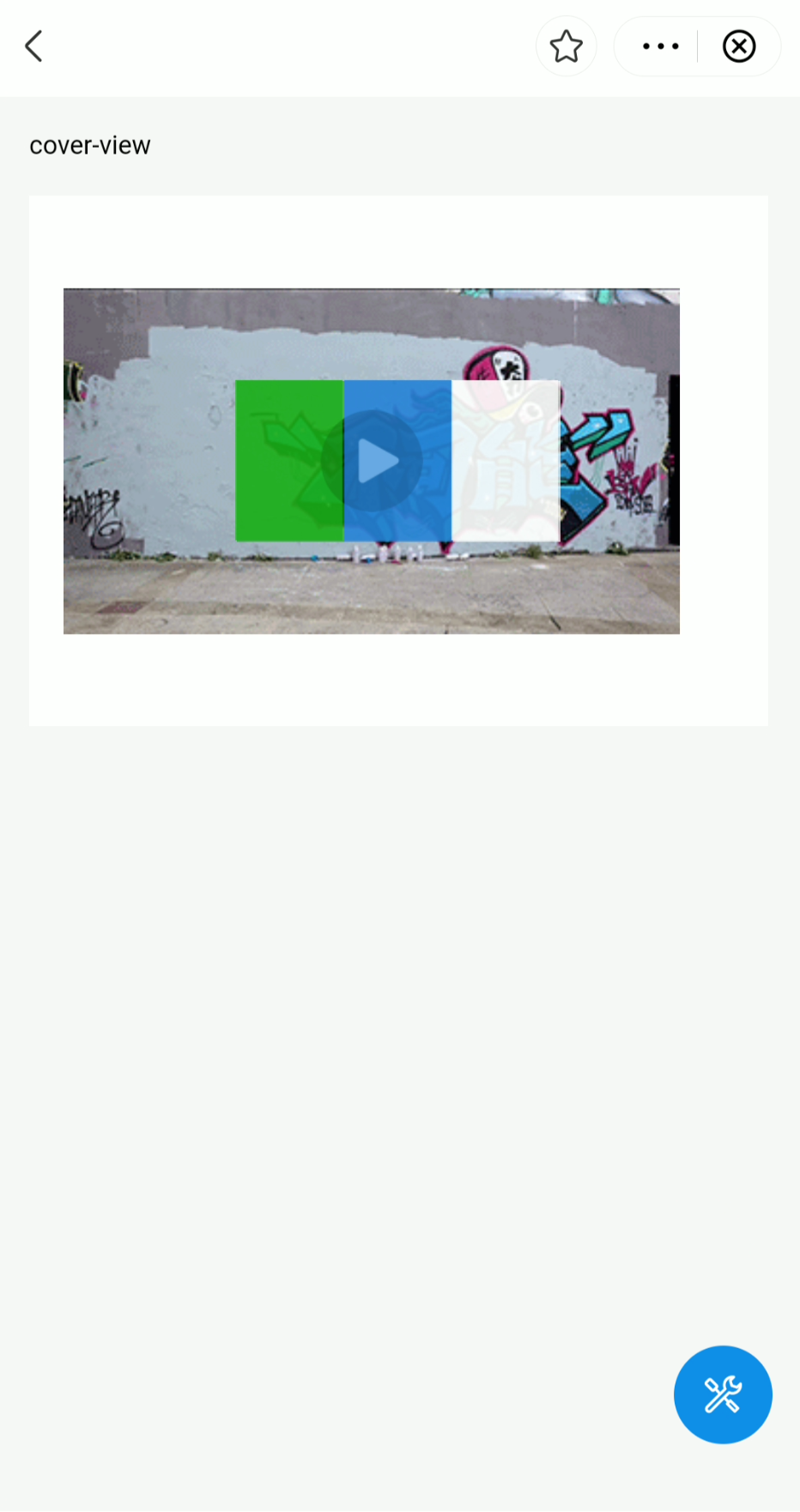
The following figure shows a text view composed of three parts, each with a background color of green, blue, and white, respectively.

Parameters
Property | Type | Description | Required |
onTap | EventHandle | The callback that is executed when the user clicks the text view. | No |
Sample codes
The following sample codes define a text view that corresponds to the example provided in User experience.
.axml
Define the page structure with the following sample code in the AXML file:
<view class="page">
  <view class="page-description">cover-view</view>
  <view class="page-section">
    <view class="page-section-demo" style="position: relative;">
      <video
        src="{{ src }}"
        class="video"
        id="video"
        poster="https://zos.alipayobjects.com/rmsportal/SSWkSLDrrgsLFDfsjzTZ.png"
      >
      </video>
      <cover-view class="cover-view">
        <cover-view class="cover-view-item cover-view-item-1"></cover-view>
        <cover-view class="cover-view-item cover-view-item-2"></cover-view>
        <cover-view class="cover-view-item cover-view-item-3"></cover-view>
      </cover-view>
    </view>
  </view>
</view>
.acss
Define the page style sheet with the following sample code in the ACSS file:
.cover-view {
  position: absolute;
  top: calc(50% - 75rpx);
  left: calc(50% - 150rpx);
  display:flex;
  flex-direction:row;
  background-color: rgba(0, 0, 0, 0);
}

.cover-view-item{
  width: 100rpx;
  height: 150rpx;
  font-size: 26rpx;
}

.cover-view-item-1 {
  background-color: rgba(26, 173, 25, 0.7);
}

.cover-view-item-2 {
  background-color: rgba(39, 130, 215, 0.7);
}

.cover-view-item-3 {
  background-color: rgba(255, 255, 255, 0.7);
}
.js
Define the page logic with the following sample code in the JS file:
Page({
  data: {
  }
});
.json
Define the page configurations with the following sample code in the JSON file:
{
  "defaultTitle": "Cover View"
}
FAQ
Does cover-view support rounded corners and shadows?
Yes, the cover-view component supports rounded corners and shadows. You can specify these properties in the ACSS file using the following sample code:
/* Rounded corners */
border-radius: 15%;

/* Shadows */
box-shadow: 10px 10px 5px #888888;