Button
Mini-program developers can use the Button component to create buttons in mini-program interfaces. This allows users to take actions or make choices, such as form submission, page redirection, and guiding users through the next steps in their journey. The Button component builds on the functionality of the basic button component, offering additional attributes for enhanced usage. This topic covers the user experience, additional attributes, and sample code for using the extended Button component.
User experience
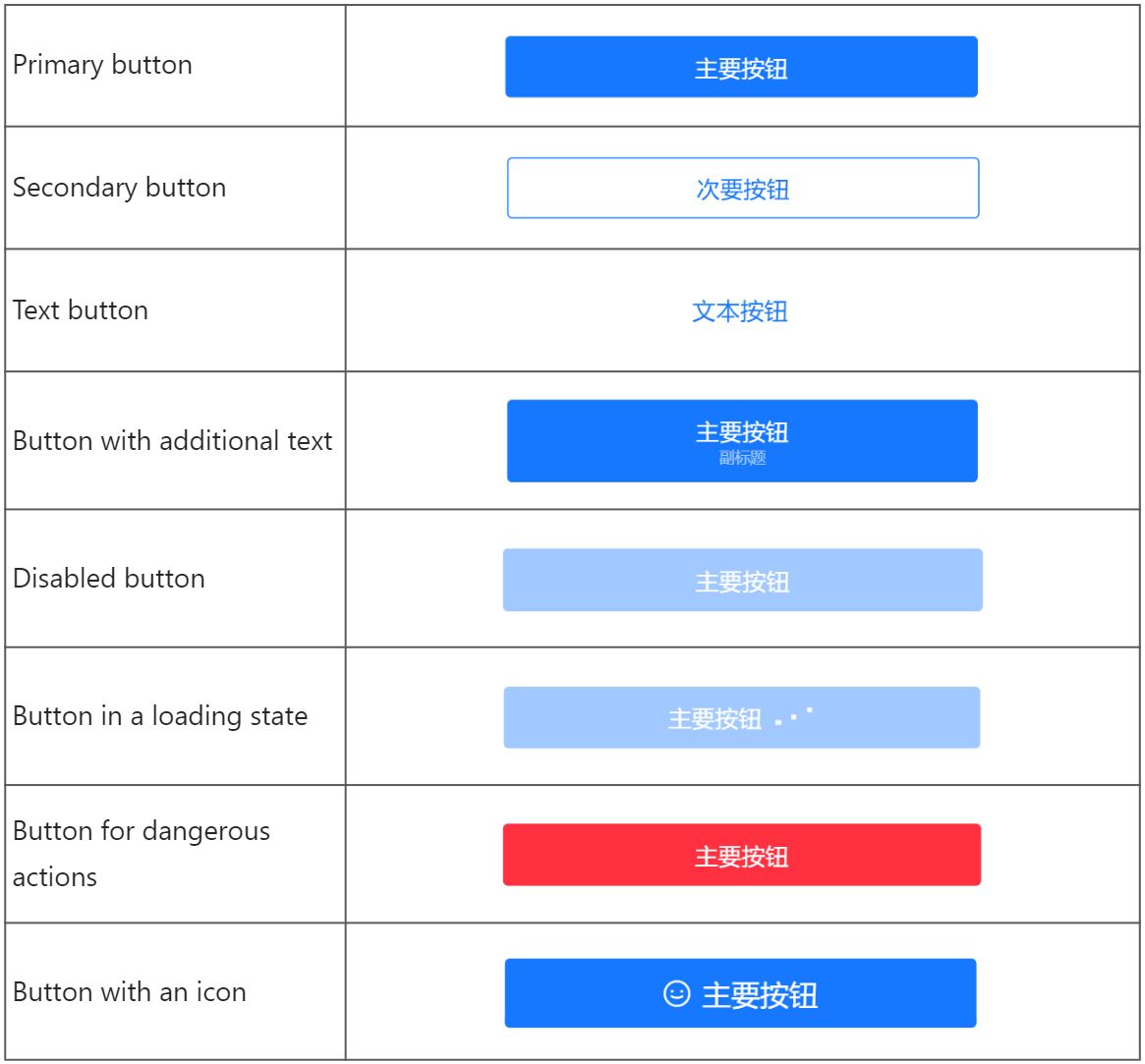
The following image shows different types of buttons:

Attributes
Attribute | Data type | Default | Description |
type | String |
| The button type. Valid values are:
|
danger | Boolean |
| Whether the button is for a dangerous action. |
disabled | Boolean |
| Whether the button is disabled for interaction. |
activeClassName | String | N/A | Class name when the button is pressed. |
className | String | N/A | The class name for the component. |
style | String | N/A | The style for the component. |
inline | Boolean |
| Whether the button is an inline button. |
icon | String | N/A | The icon displayed on the left side of the button. Specify this attribute using the icon names listed in Icon. |
loading | Boolean | N/A | Whether the button is in a loading state. Note that buttons in a loading state are not clickable. |
size | String |
| The button size. This attribute is supported when inline is set to
|
subText | String | N/A | Additional text that is displayed under the button name. This attribute is supported when inline is either unspecified or set to |
catchTap | EventHandle | N/A | The callback function that is triggered when the button is clicked (non-bubbling). |
onTap | EventHandle | N/A | The callback function that is triggered when the button is clicked. |
Sample code
The following sample code shows how to create different buttons:
.axml
<ant-container
  title="Button examples"
  className="list">
  <ant-button
    type="primary"
    onTap="handleTap">
    Basic primary button
  </ant-button>

  <ant-button
    type="default"
    onTap="handleTap">
    Basic secondary button
  </ant-button>

  <ant-button
    type="text"
    onTap="handleTap">
    Basic text button
  </ant-button>

  <ant-button
    type="primary"
    subText="Additional text"
    onTap="handleTap">
    Button with additional text
  </ant-button>

  <ant-button
    type="primary"
    disabled>
    Disabled button
  </ant-button>

  <ant-button
    type="primary"
    loading>
    Button in a loading state
  </ant-button>

  <ant-button
    type="primary"
    danger
    onTap="handleTap">
    Button for dangerous actions
  </ant-button>
</ant-container>
.js
Page({
  handleTap(e) {
    my.alert({
      title: 'Button Clicked',
    });
  },
});
.acss
button {
  margin-bottom: 8px;
}
.json
{
  "defaultTitle": "Button",
  "usingComponents": {
    "ant-button": "antd-mini/es/Button/index",
    "ant-container": "antd-mini/es/Container/index"
  }
}