

Tabs
Mini-program developers can use the Tabs component to organize content into distinct groups, enabling users to easily switch between different views without leaving the current page. This topic covers the user experience, attribute details, and sample code for the Tabs component.
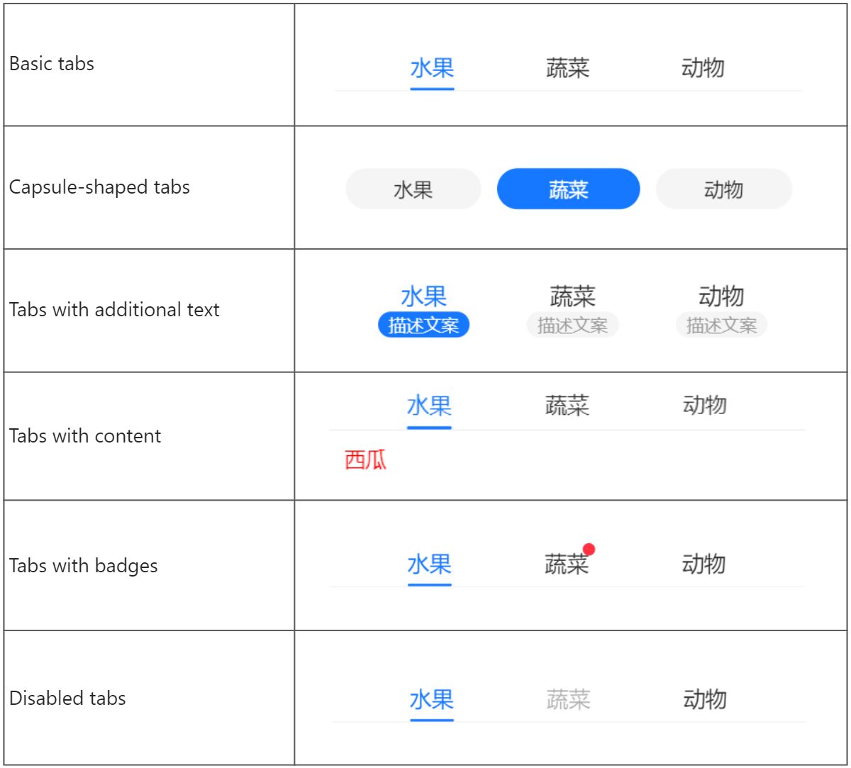
User experience
The following image shows different types of tabs:
Attributes
Attribute | Data type | Default | Description |
className | String | N/A | The class name for the component. |
style | String | N/A | The style for the component. |
current | Number | N/A | The index of the current active tab. |
defaultCurrent | Number |
| The index of the default active tab. |
direction | String |
| The direction of the tabs. Valid values are:
|
tabsBarClassName | String | N/A | The class name for the tab bar. |
tabClassName | String | N/A | The class name for the individual tabs. |
tabActiveClassName | String | N/A | The class name for the active tab. |
items | Array<Item> | N/A | The individual tabs. Specify at least one tab. |
plus | Slot | N/A | The slot for a button in the top-right corner. The slot-scope attribute includes value (corresponding to Item) and index (corresponding to the index of the Item). |
title | Slot | N/A | The customized tab names. The slot-scope attribute includes value (corresponding to Item) and index (corresponding to the index of the Item). |
type | String |
| The tab type. Valid values are:
|
scrollMode | String |
| The automatic scroll mode for the active tab. Valid values are:
|
onChange | EventHandle | N/A | The callback function that is triggered when the tab is switched. |
Item
Note: The Item object supports customized attributes like content and badge, which is accessible via slot-scope. For more information, see the sample code in Item with customized attributes.
Attribute | Data type | Default | Description |
title | String | N/A | The tab name. |
Sample code
Tab examples
The following sample code shows how to create different tabs:
.axml
<ant-container title="Basic tabs">
  <ant-tabs items="{{ items }}" />
</ant-container>

<ant-container title="Show content">
  <ant-tabs items="{{ items }}">
    <view
      class="content"
      slot-scope="item">
      {{ item.value.content }}
    </view>
  </ant-tabs>
</ant-container>

<ant-container title="Capsule-shaped tabs">
  <ant-tabs
    type="capsule"
    items="{{ items }}"
    defaultCurrent="{{ 1 }}" />
</ant-container>

<ant-container title="Show additional text">
  <ant-tabs
    type="mixin"
    items="{{ items }}" />
</ant-container>

<ant-container title="Show badges">
  <ant-tabs items="{{ items }}">
    <view
      slot="title"
      slot-scope="item">
      <view a:if="{{ item.value.badge }}">
        <ant-badge>{{ item.value.title }}</ant-badge>
      </view>
      <view a:else>{{ item.value.title }}</view>
    </view>
  </ant-tabs>
</ant-container>

<ant-container title="Disable tabs">
  <ant-tabs items="{{ items2 }}" />
</ant-container>

<ant-container title="onChange">
  <ant-tabs
    items="{{ items }}"
    onChange="onChange" />
</ant-container>

<ant-container title="Add plus button">
  <ant-tabs items="{{ items }}">
    <view slot="plus">
      <ant-icon
        type="AddOutline"
        onTap="onPlus" />
    </view>
  </ant-tabs>
</ant-container>

<ant-container title="Control mode">
  <ant-tabs
    items="{{ items }}"
    current="{{ current }}"
    onChange="handleChange" />
</ant-container>

<ant-container title="Customize content outside Tabs">
  <ant-tabs
    items="{{ items }}"
    current="{{ current }}"
    onChange="handleChange" />
  <view class="content">{{ items[current].content }}</view>
</ant-container>
.js
Page({
    data: {
        current: 0,
        items: [
            {
                title: 'Fruits',
                subTitle: 'Additional text',
                content: 'Watermelon',
            },
            {
                title: 'Vegetables',
                subTitle: 'Addtional text',
                badge: true,
                content: 'Tomato',
            },
            {
                title: 'Animals',
                subTitle: 'Additional text',
                content: 'Ant',
            },
        ],
        items2: [
            {
                title: 'Fruits',
                subTitle: 'Addtional text',
                content: 'Watermelon',
            },
            {
                title: 'Vegetables',
                subTitle: 'Additional text',
                content: 'Tomato',
                disabled: true,
            },
            {
                title: 'Animals',
                subTitle: 'Additional text',
                content: 'Ant',
            },
        ],
    },
    onChange(current) {
        this.alert('current ' + current);
    },
    handleChange(current) {
        this.setData({
            current,
        });
    },
    onPlus() {
        this.alert('plus');
    },
    alert(content) {
        my.alert({
            title: content,
        });
    },
});
.acss
.content {
  color: red;
  padding: 12px;
}
.json
{
  "defaultTitle": "Tabs",
  "usingComponents": {
    "ant-container": "antd-mini/es/Container/index",
    "ant-tabs": "antd-mini/es/Tabs/index",
    "ant-badge": "antd-mini/es/Badge/index",
    "ant-icon": "antd-mini/es/Icon/index"
  }
}
Item with customized attributes
The following sample code shows how to define customized attributes in the Item object:
.js
Page({
  data: {
    items: [
      {
        title: 'tab 1',
        content: 'tab 1 content',
      },
      {
        title: 'tab 2',
        content: 'tab 2 content',
      },
      {
        title: 'tab 3',
        content: 'tab 3 content'
      }
    ]
  }
})
.axml
<ant-tabs items="{{items}}">
  <view slot="title" slot-scope="tab">
    {{ tab.index }}:{{ tab.value.title }},{{ tab.value.content }}
  </view>
</ant-tabs>
FAQ
How can I trigger the onChange callback when the current active tab is clicked?
To trigger the onChange callback upon clicking the current active tab, you can use the onTap event on the tab's view element. See the following sample code for details:
- Set the onTap events for the click events of the current active tab in the AXML file:
<ant-tabs items="{{items}}" onChange="onChange">
  <view slot="title" slot-scope="tab" data-index="{{tab.index}}" onTap="onTap">
    {{ tab.value.title }}
  </view>
</ant-tabs>- Call the onChange method within the event handler in the JS file:
Page({
  onChange(index) {
    console.log(index)
  },
  onTap(e) {
    const { index } = e.currentTarget.dataset
  }
})