Consistency

For merchants and mass entrepreneurs, Mini Programs can greatly reduce costs and feature a rich and flexible user interface. Combined with the App Container, Mini Programs can be integrated into Android and iOS mobile platforms. Therefore, a set of unified and standardized components for Mini Program design and development is available. This allows the user experience more consistent with the overall UI and UX of the product.
The Importance Of Consistent Experience
The Mini Program designed by a merchant needs to be as consistent as possible with other products of the merchant, including apps and websites, in terms of visuals, interactions, copywriting style, functionality, and ethos. A consistent user experience can unite brand minds and improve user satisfaction. In addition, it also provides the following benefits:
Feeling of Familiarity
The consistent user experience across products, including Mini Programs, apps, and websites, enables users to quickly identify the products of a merchant or enterprise.
Ease of Use
The consistent experience across products can reduce both the learning and use costs for users and make products easier to use.
High Efficiency
The consistency in design and functionality across products, including Mini Programs, apps, and websites, enables users to complete tasks faster when they use the product through a cross-form approach.
Trustworthiness
A consistent UX design across different Mini Programs makes it easier for a merchant or enterprise to gain the trust of users.
UX Design For Mini Programs
When it comes to the design of Mini Programs, the following three aspects can make the user experience more consistent. This will create an all-around consistent product image for users and the brand DNA will also be presented at every touchpoint of the user journey.
1. Core Functionality
The Mini Program designed by a merchant must first be consistent with other products of the merchant in terms of the core functions provided. Merchants need to know: which functional features support the lifeblood of their business? Which processes are most frequently required by users? One of the features of Mini Programs is Simplicity, the UX design must focus on the core functionality. 
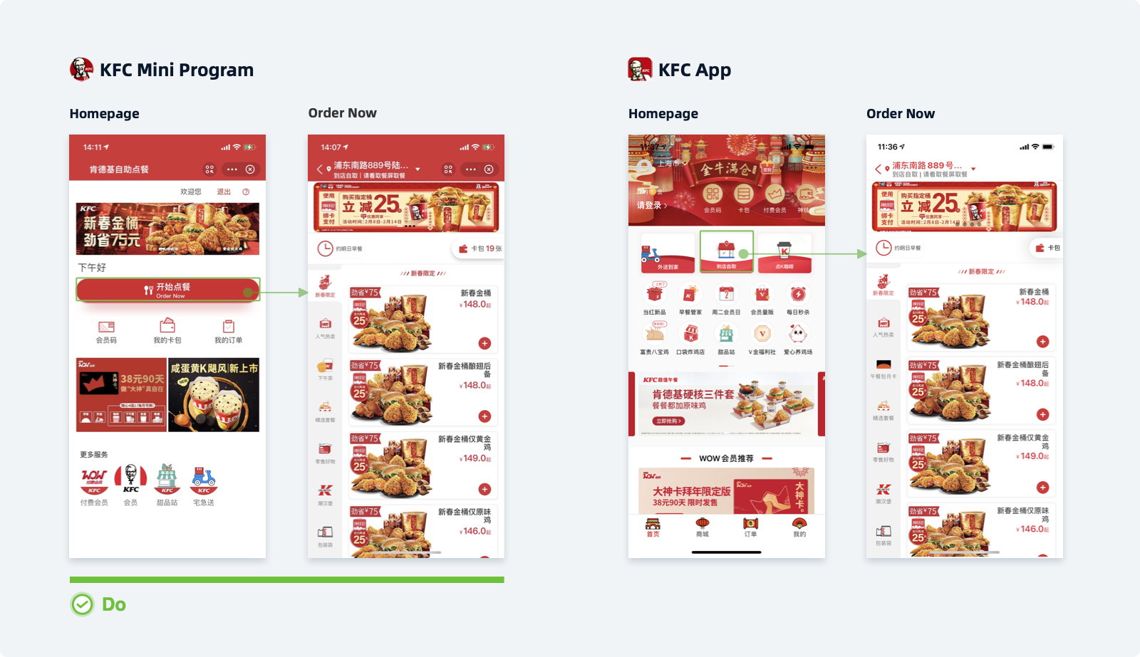
The Mini Program launched by KFC in the Chinese mainland highlights its core function — ordering food. Compared with the KFC App, which has a wide range of functions, most of the functions have been removed in the Mini Program. There is only an "Order Now" button on a similar screen position and the button is visually emphasized. The "Order Now" page of the KFC Mini Program is identical in design to that of the KFC App. This makes it easy for users who are already familiar with the app to get started with the Mini Program.
2. User Data
For users, the Mini Programs, apps, and websites of a merchant are all products provided by the same company. Therefore, the merchant needs to connect the user data of each product and maintain and update the data. That is how the merchant can continue to use the registered account information and membership data to provide a consistent user experience.
3. Visual Design
The correlation and regularity between visual designs of Mini Programs and those of other products of a merchant is also a major factor in determining a consistent experience. A consistent brand image and UI style reflect the philosophy and attitude of a merchant, creating a sense of trust and expectation among users of other products of the merchant. 
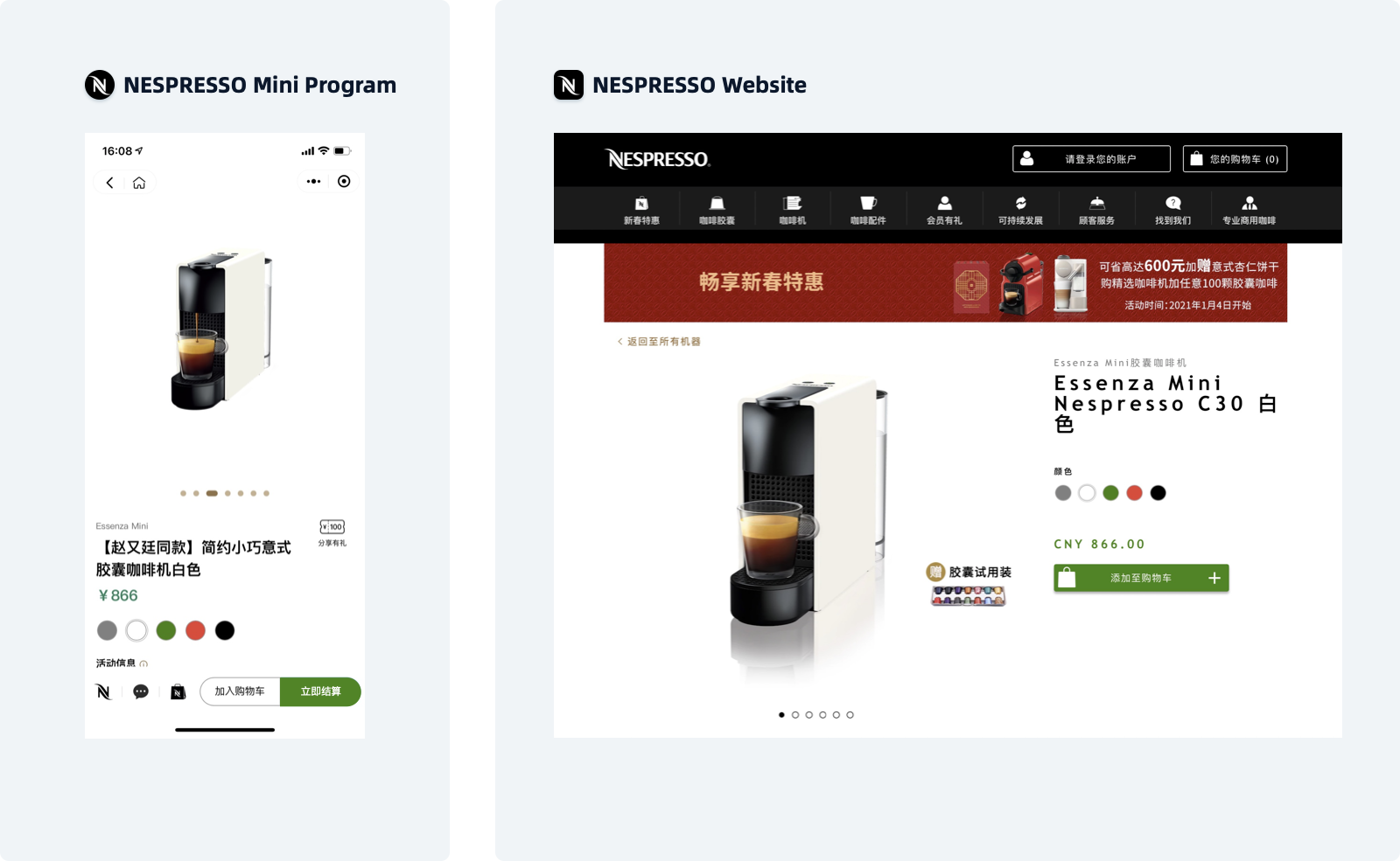
The visual style designed by Nespresso is consistent across all forms of its products, from the selection style of product color to the button color then to the icon style.
