input
Input box
Property | Type | Default | Description |
| value | String | Initial contents. | |
| name | String | Component name, used for the form submission of obtained data. | |
type | String | text | The type of data that users can enter in the input field. Valid values are:
|
| password | Boolean | false | Is password type or not. |
| placeholder | String | Placeholder . | |
| placeholder-style | String | Specify placeholder style. | |
| placeholder-class | String | Specify placeholder style class. | |
| disabled | Boolean | false | Disable or not. |
| maxlength | Number | 140 | Maximum length. |
| cursor | Number | Cursor location when specifying focus. | |
| onInput | EventHandle | Trigger input event on keyboard entry, event.detail = {value: value}. | |
| onConfirm | EventHandle | Trigger on clicking keyboard completion, event.detail = {value: value}. | |
| onFocus | EventHandle | Trigger on getting focus, event.detail = {value: value}. | |
| onBlur | EventHandle | Trigger on losing focus, event.detail = {value: value}. |
Note (For iOS):
Due to iOS system restrictions, the input component has the following known issues:
- The cursor of input might be misaligned with the input element.
- The keyboard might be hidden with long press onthe input.
To solve these issues, add enableNative={{false}} to the input element of your MiniProgram code to downgrade to pure HTML5 elements.
Now the enableNative property is set to false. In this case,the number type is no longer supported, and only text type input is supported for inputs.
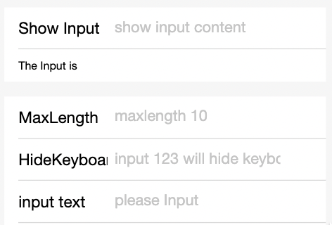
Screenshot

Sample Code
copy
<input maxlength="10" placeholder="maximum entered length 10" />
<input onInput="bindKeyInput" placeholder="entry synchronized to view"/>
<input password type="text" placeholder="This is a password entry box" />
copy
Page({
  data: {
    inputValue: '',
  },
  bindKeyInput(e) {
    this.setData({
      inputValue: e.detail.value,
    });
  },
});