Icon
Mini-program developers can use the Icon component to incorporate semantic vector graphics into your mini programs. It enables you to represent content or actions through metaphorical visuals, delivering clear and friendly guidance to users. The Icon component builds on the functionality of the basic icon component, offering additional attributes and predefined icons for enhanced usage. This topic covers the predefined icons, additional attributes, and sample code for the Icon component.
Icon list
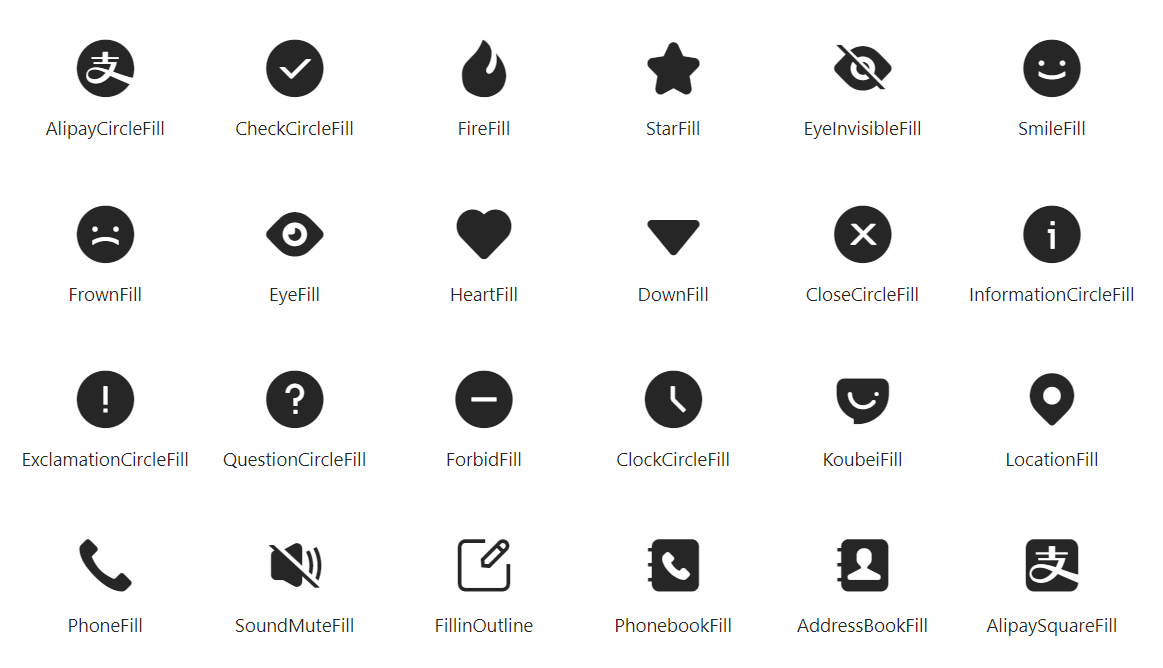
The following images show the graphics and names of the predefined icons:

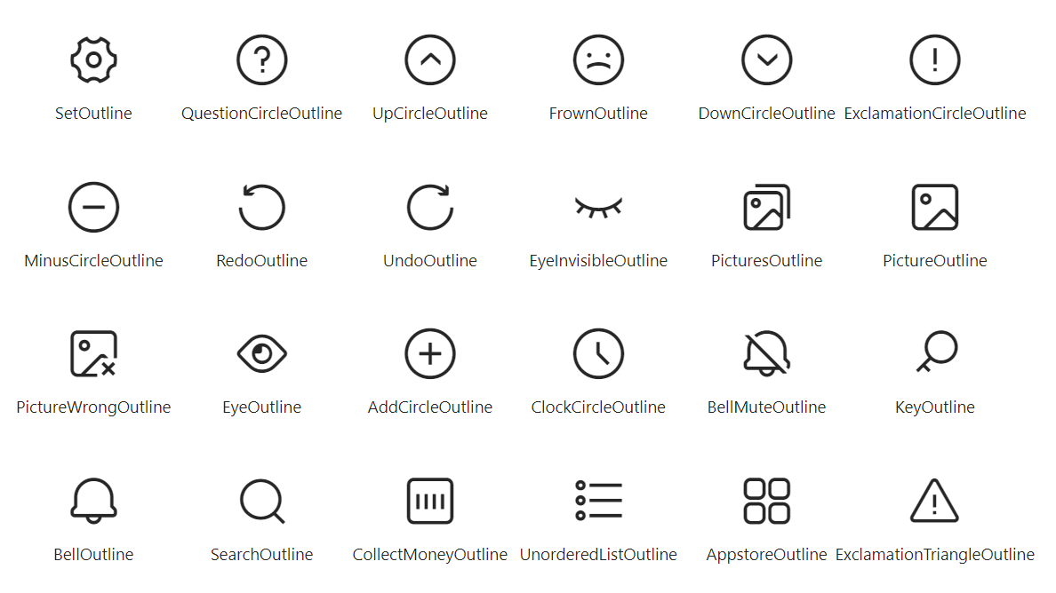
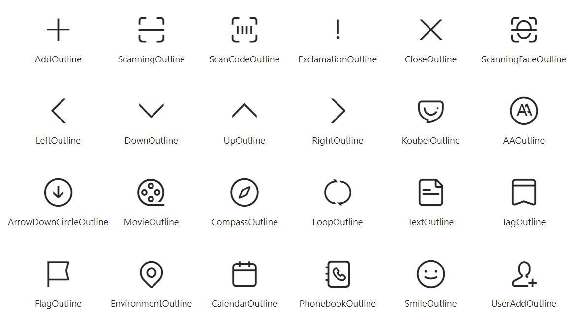
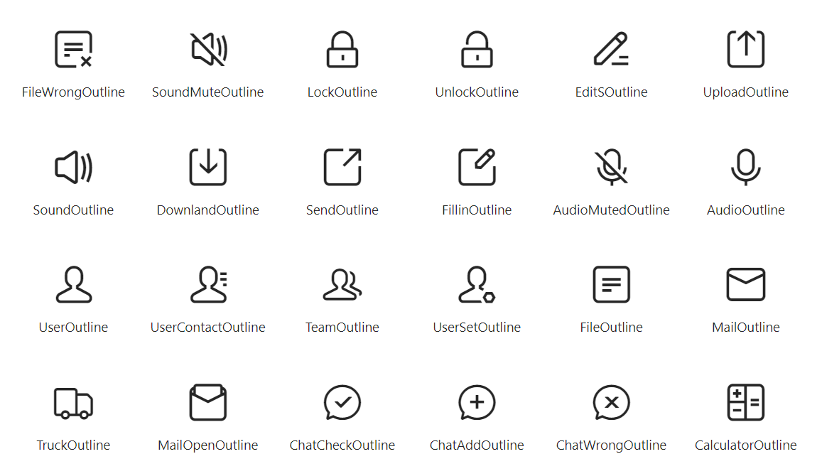
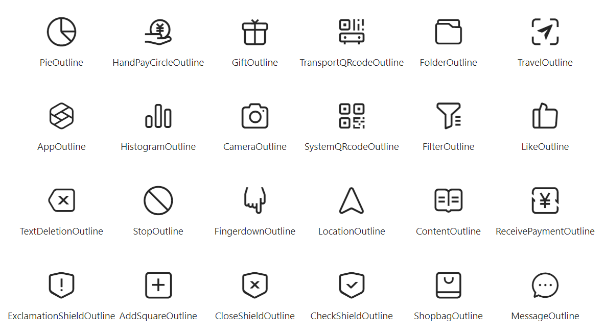

Attributes
Attribute | Data type | Default | Description |
className | String | N/A | The class name for the component. |
style | String | N/A | The style for the component. |
type | String | N/A | The type of the icon. Specify this attribute using the icon names provided in Icon list. |
catchTap | EventHandle | N/A | The callback function that is triggered when the icon is clicked (non-bubbling). |
onTap | EventHandle | N/A | The callback function that is triggered when the icon is clicked. |
Sample code
The following sample code shows how to use the predefined icons in mini programs:
.axml
<ant-icon
  onTap="handleTap"
  data-id="icon"
  type="SmileOutline"
  style="font-size: 50px;"
/>
.js
Page({
  handleTap(e) {
    console.log(e);
    console.log('detail', e.detail);
    console.log('e.currentTarget.dataset', e.currentTarget.dataset);
    console.log('e.target.dataset', e.target.dataset);
    console.log('e.target.targetDataset', e.target.targetDataset);
  },
});
.json
{
  "defaultTitle": "Icon",
  "usingComponents": {
    "ant-icon": "antd-mini/es/Icon/index",
  }
}