Navigation
Provide Clear Navigation and Direction
Whenever users enter your Mini Program, you have the responsibility and obligation to clearly inform users where they are currently and where they can go from their current location, and to ensure that users can easily browse through pages without getting lost. This enables you to offer users a safe and enjoyable experience. Navigation is critical to protect users from getting lost when browsing through pages, it must inform users of matters including the current location, possible destinations, and how to get back.
Mini Program official top navigation
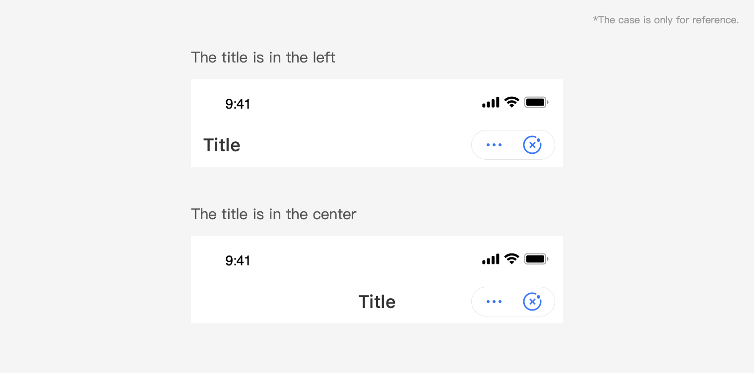
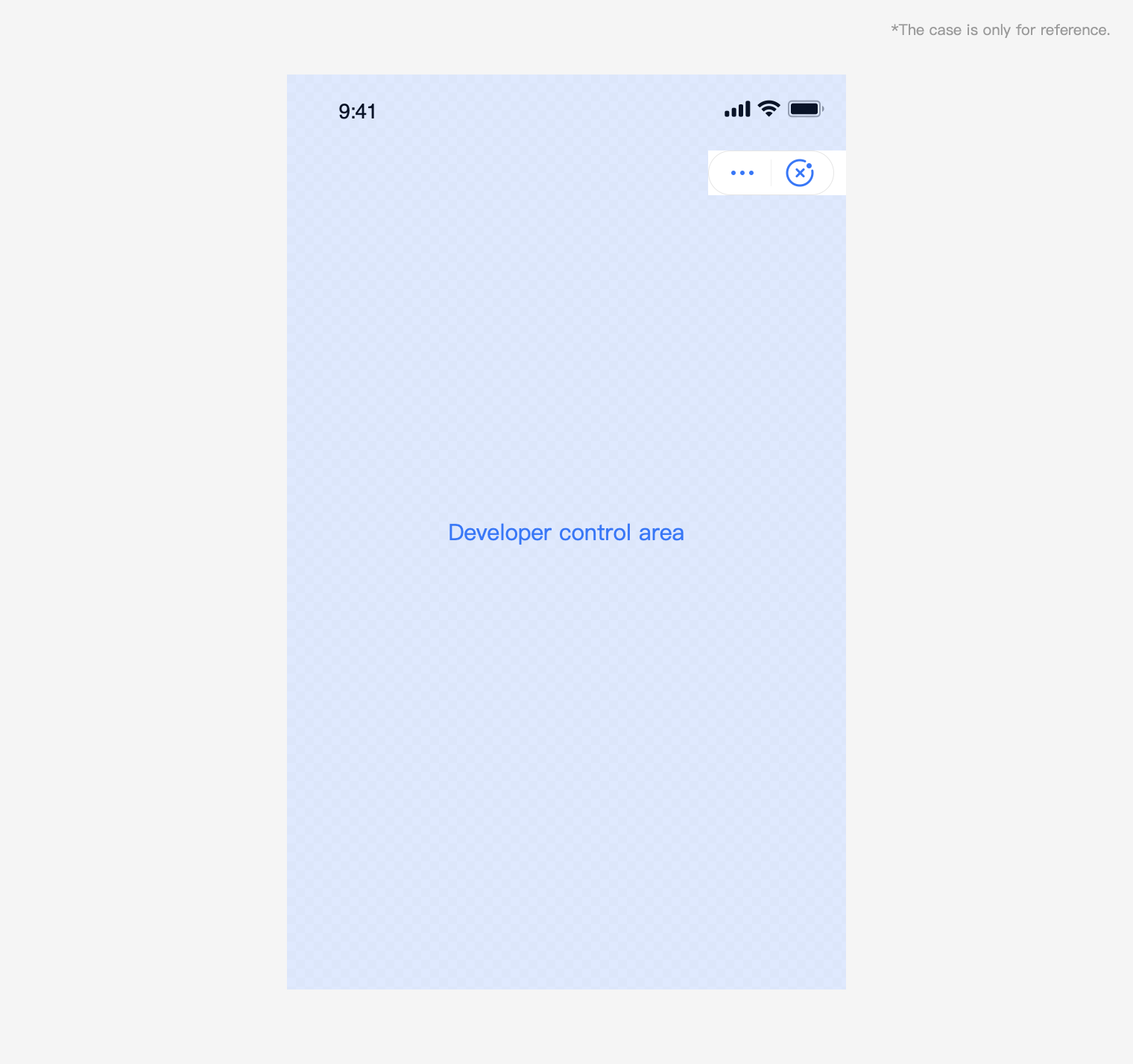
For all pages of Mini Program, including embedded webpages and plug-ins, Mini Program places a navigation in the top, which is shown below. You can place your title in the left or center. The Mini Program official top navigation has a fixed position in the page. Do not place other items in this position during design. When you need to add interactive elements around this position, be aware whether the interactive event conflicts and whether the operation is easy to use.
Top navigation color scheme
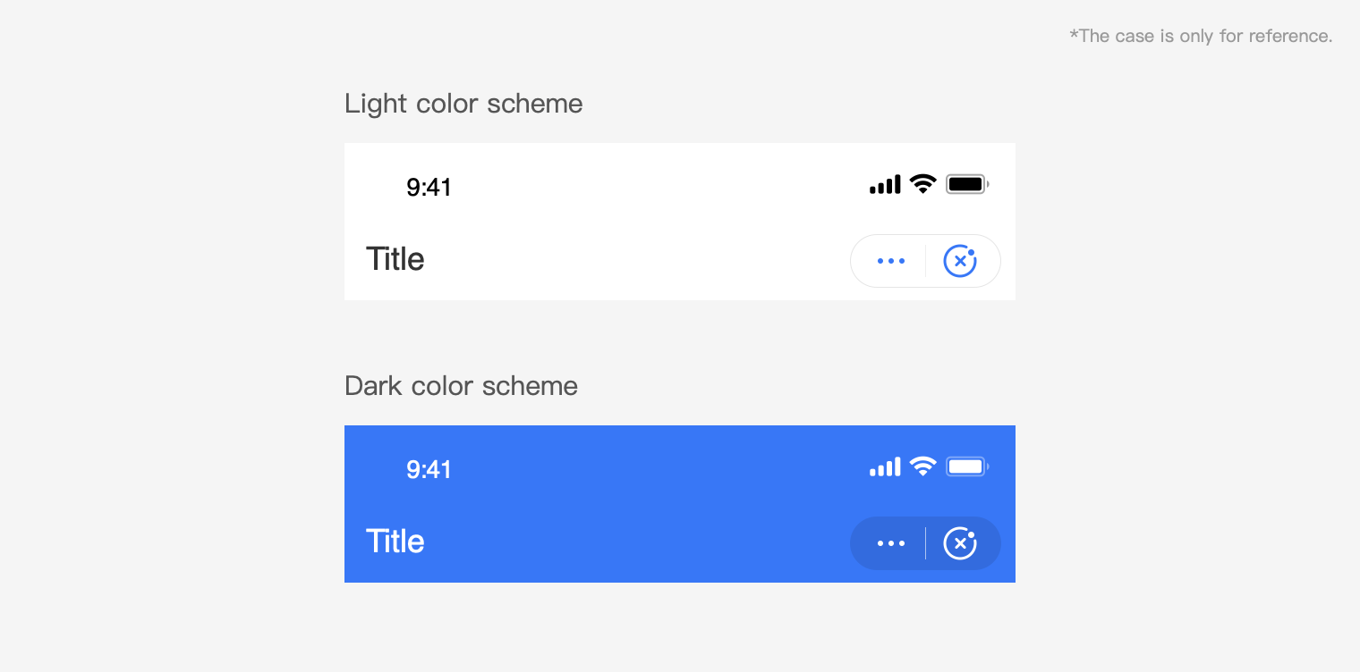
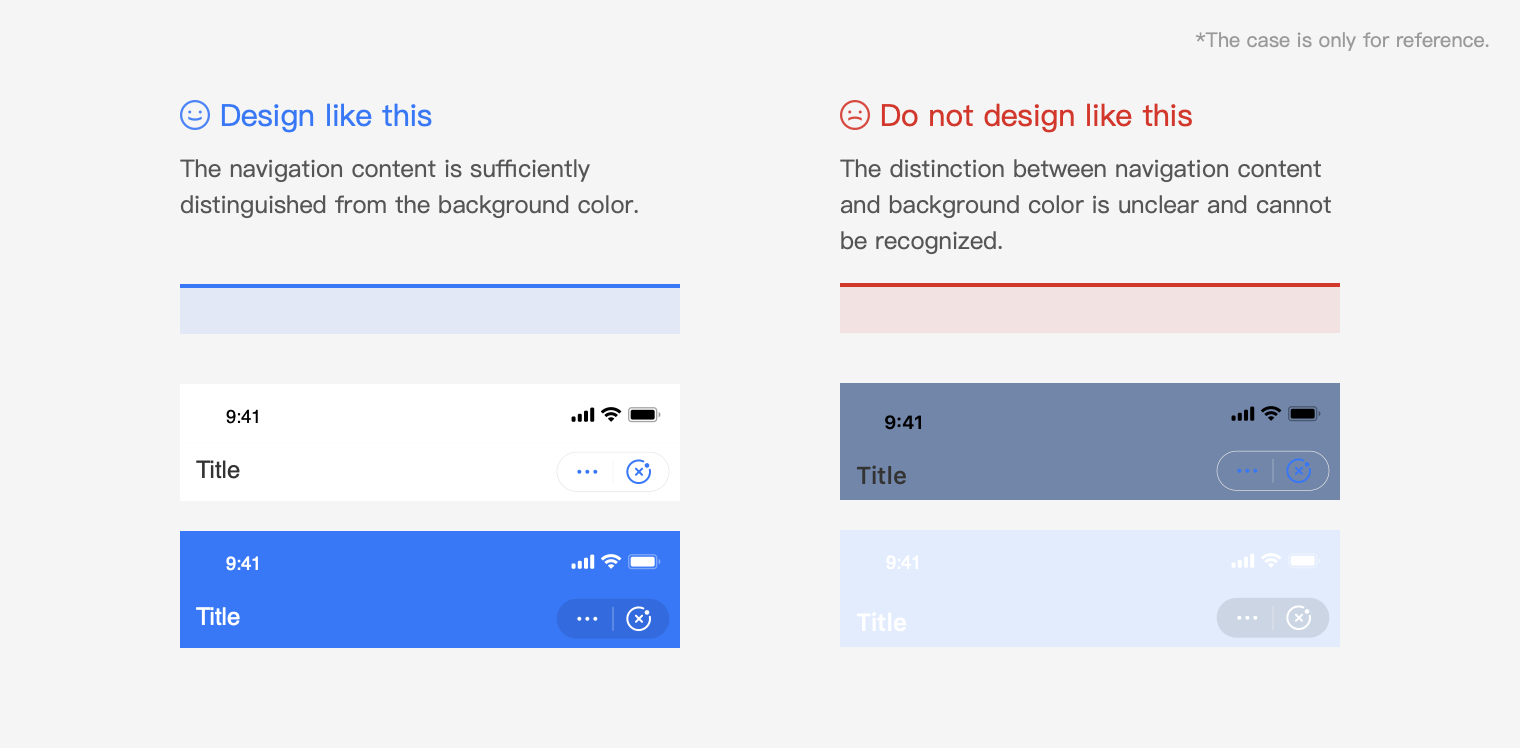
Mini Program provides dark/light navigation color scheme for you. You can select corresponding one according to your brand style and guarantee the readability of top navigation.
Top navigation interaction flow
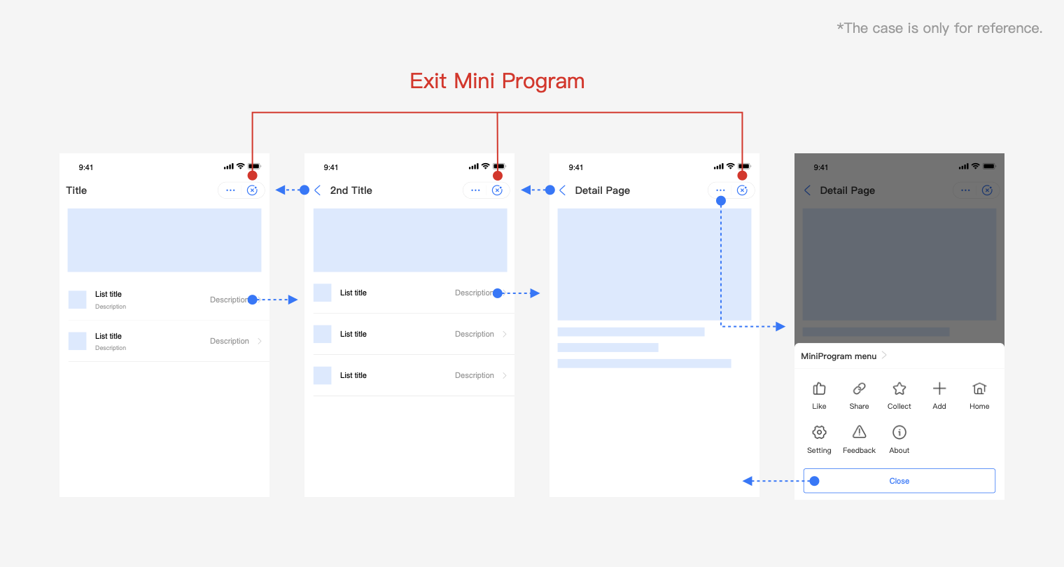
Operations of Mini Program navigation:
1.Click More to display menu option
2. Click Close to exit the current Mini Program
3.Click Return to return to the previous level by default
In-page navigation
You can add your own navigation within the page based on your functional design requirements. Consistency in navigation operations must be maintained across all pages to facilitate movements backward and forward. Due to the limited size of the mobile screen, tryto keep your Mini Program page navigation operations simple and easy. It is recommended to design your Mini Program navigation obviously different from the official Mini Program navigation for easy distinction.

Top tab bar
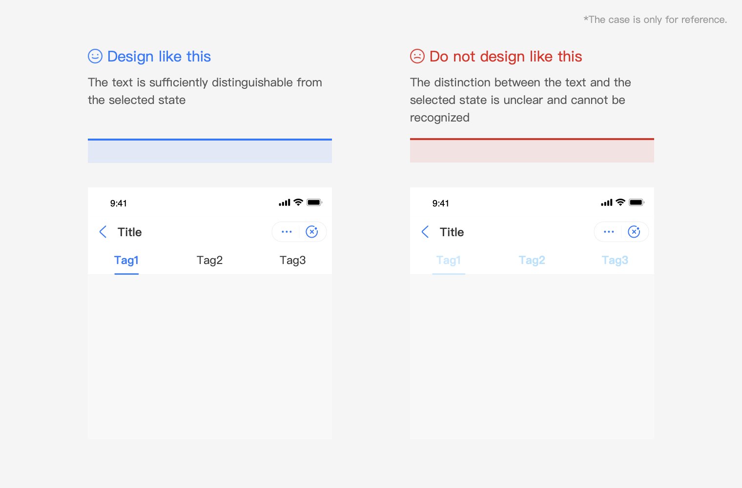
You can customize the color of the top tab bar. When selecting the color, you must be aware of the usability, visibility, and accessibility of the tab bar.
Bottom tab bar
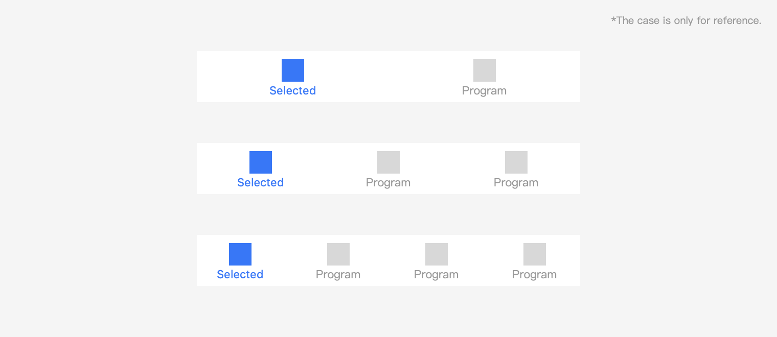
Bottom tab bar is used to switch between different horizontal tabs of the homepage. It is always fixed at the bottom of the screen and does not roll and hide along with the page. The number of tabs must be between two and four (both inclusive). To ensure sufficient space for easy tapping, it is recommended to use not more than four tabs. A single page should only contain one tab bar. The text and icon of the current option need to be highlighted. The bottom tab bar is recommended to be used carefully according to the specific situation.
