GriverBackHomeButtonStyleExtension
IAPMiniProgram SDK provides the ability to customize the style of the Back to the homepage button in the title bar of the mini program, so that the Super App can use its own text or image to customize and render this button of the mini programs accordingly.
Follow this topic to realize this customization ability by implementing the specific interface of IAPMiniProgram SDK.
Procedures
Step 1. Implement the GriverBackHomeButtonStyleExtension interface
Implement the GriverBackHomeButtonStyleExtension interface and write code in the required methods according to your business logic.
Code sample as follows:
class CustomGriverHomeButtonStyleExtensionImpl : GriverBackHomeButtonStyleExtension {
    override fun getType(): String {
        return "icon"
    }

    override fun getContent(): String {
        return "Home"
    }

    override fun getIconDrawable(): Drawable {
        return context.getResources().getDrawable(R.drawable.custom_home)
    }
}
Step 2. Register the CustomGriverHomeButtonStyleExtensionImpl class
Refer to the following sample code and call the registerExtension interface to register after initializing the SDK.
IAPConnect.init(application, initConfig, object : InitCallback {
    override fun onSuccess() {
        //···
        Griver.registerExtension(
            GriverExtensionManifest(
                GriverBackHomeButtonStyleExtension::class.java,
                CustomGriverHomeButtonStyleExtensionImpl()
            )
        )
    }
})
Then you can view the following screenshots for user experience.
Structures
GriverBackHomeButtonStyleExtension interface
The definition of this interface is shown in the following codes:
interface GriverBackHomeButtonStyleExtension : GriverButtonStyleExtension {

}

interface GriverButtonStyleExtension : GriverExtension {

    fun getType(): String

    fun getContent(): String

    fun getIconDrawable(): Drawable
}
Methods
Based on the interface definition, it provides the following methods:
Method | Description |
getType | This method returns the customized style of the Back to the homepage button. The following types of style (return value) are supported:
Note: If other value is returned, this customization ability does not take effect.
|
getContent | This method is called when the return value of the getType method is This method returns the customized display text of the Back to the homepage button. Note: Because of the current width limitation of this back button component, the custom text may not be fully displayed. |
getIconDrawable | This method is called when the return value of the getType method is This method returns the customized image resource of the Back to the homepage button. |
Appendices
UI illustration
Condition | Screenshot |
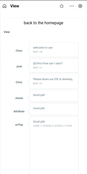
Default UI |
|
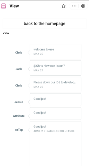
When the getType method returns |
|
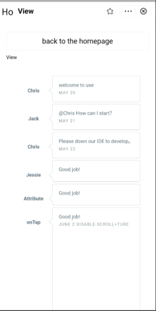
When the getType method returns Tip: The custom text may not be fully displayed. For example, in the given screenshot, "Ho" is only displayed. |
|


