Collapse
Mini-program developers can use the Collapse component to create collapsible and expandable content areas. This makes the interface cleaner and less cluttered, allowing users to selectively view or hide content. This topic covers the user experience, attribute details, and sample code for the Collapse component.
User experience
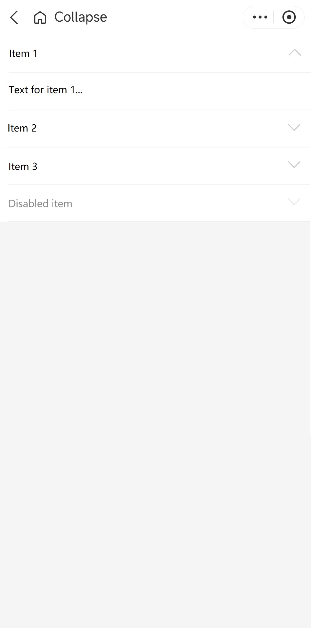
The following image shows a Collapse component with four content areas: three that are active and one that is disabled.

Attributes
Attribute | Data type | Default | Description |
className | String | N/A | The class name for the component. |
style | String | N/A | The style for the component. |
current | Array<Number> | N/A | The indexes of the currently expanded content areas. |
defaultCurrent | Array<Number> | N/A | The indexes of the default expanded content areas. |
accordion | Boolean |
| Whether the component operates in accordion mode, where only one content area can be expanded at a time. |
content | Slot | N/A | The slot for the content area. It accepts the value and index attributes. |
items | Array<CollapseItem> | N/A | The collapsible content areas in the component. |
title | slot | N/A | The slot for the title. It accepts the value and index attributes. |
onChange | EventHandle | N/A | The callback function that is triggered when the content area is changed. |
CollapseItem
Attribute | Data type | Default | Description |
content | String | N/A | The content of the area. |
disabled | Boolean |
| Whether the area is disabled for user interactions. |
title | String | N/A | The title of the area. |
Sample Code
The following sample code demonstrates how to create a Collapse component that is shown in User experience:
.axml
<ant-collapse
  defaultCurrent="{{ [0] }}"
  items="{{ items }}"
  onChange="onChange" />
.js
Page({
  data: {
    items: [
      {
        title: 'Item 1',
        content: 'Text for item 1...'
      },
      {
        title: 'Item 2',
        content: 'Text for item 2...'
      },
      {
        title: 'Item 3',
        content: 'Text for item 3...'
      },
      {
        title: 'Disabled item',
        disabled: true,
      }
    ]
  },
  onChange(current) {
    console.log(current);
  }
});
.json
{
  "defaultTitle": "Collapse",
  "usingComponents": {
    "ant-collapse": "antd-mini/es/Collapse/index"
  }
}