Divider
Mini-program developers can use the Divider component to enhance the organization of content by creating clear visual boundaries between different sections or groups of elements. This topic covers the user experience, attribute details, and sample code for the Divider component.
User experience
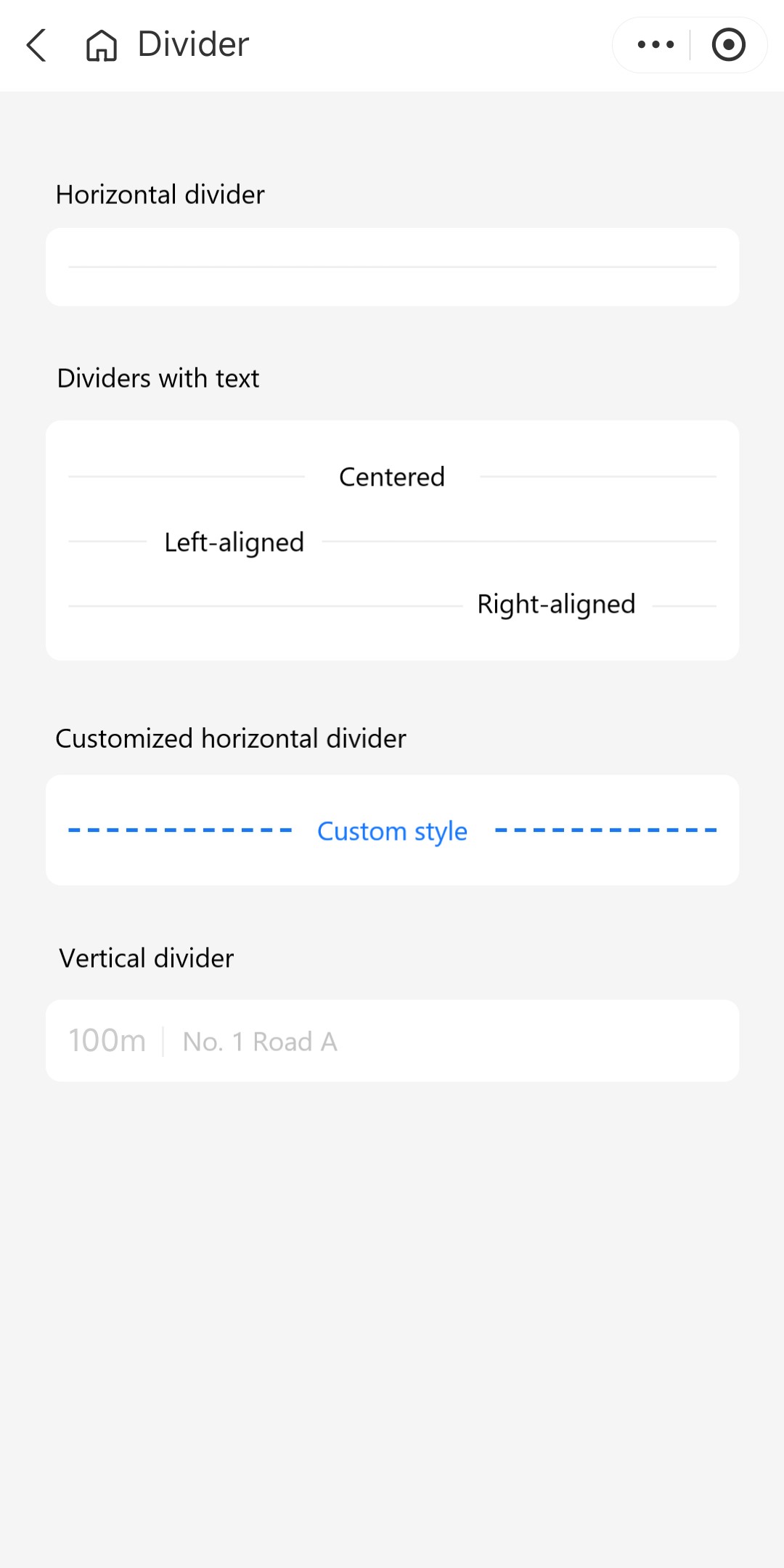
The following image shows different dividers:

Attributes
Attribute | Data type | Default | Description |
className | String | N/A | The class name for the root node of the divider. |
style | String | N/A | The style for the divider. |
direction | String |
| The direction of the divider. Valid values are:
|
lineColor | String | N/A | The color of the divider line. |
lineType | String |
| The type of the divider line. Valid values are:
|
lineHeight | Number | N/A | The height of the divider line in pixels. This attribute is applicable when direction is |
lineWidth | Number | N/A | The width of the divider line in pixels. This attribute is applicable when direction is |
text | String, Slot | N/A | The text content within the divider. |
textClassName | String | N/A | The class name for the text within the divider. |
textPosition | String |
| The text position relative to the divider. Valid values are:
|
textStyle | String | N/A | The style for the text within the divider. |
Sample code
The following sample code demonstrates how to create the dividers that are shown in User experience:
.axml
<ant-container
  title="Horizontal divider"
  headerInBox="{{ false }}">
  <ant-divider />
</ant-container>

<ant-container
  title="Dividers with text"
  headerInBox="{{ false }}">
  <ant-divider text="Centered" />
  <ant-divider
    text="Left-aligned"
    textPosition="left" />
  <ant-divider
    text="Right-aligned"
    textPosition="right" />
</ant-container>

<ant-container
  title="Customized horizontal divider"
  headerInBox="{{ false }}">
  <ant-divider
    text="Custom style"
    textStyle="color:#1677ff; fontWeight:600"
    lineHeight="{{ 2 }}"
    lineType="dashed"
    lineColor="#1677ff" />
</ant-container>

<ant-container
  title="Vertical divider"
  headerInBox="{{ false }}">
  <view class="divider-vertical">
    <view>100m</view>
    <ant-divider direction="vertical" />
    <view>No. 1 Road A</view>
  </view>
</ant-container>
.js
Page({
  data: {},
});
.acss
page {
  padding: 24px;
}
.divider-vertical {
  display: flex;
  justify-content: flex-start;
  align-items: center;
  color: #cccccc;
}
.json
{
  "defaultTitle": "Divider",
  "usingComponents": {
    "ant-divider": "antd-mini/es/Divider/index",
    "ant-container": "antd-mini/es/Container/index"
  }
}