List
Mini-program developers can use the List component and its accompanying ListItem component to create a container for list items and the individual items within a list respectively. It helps present information in a list format, providing a clean and organized interface. This topic covers the user experience, attribute details, and sample code for the List and ListItem components.
User experience
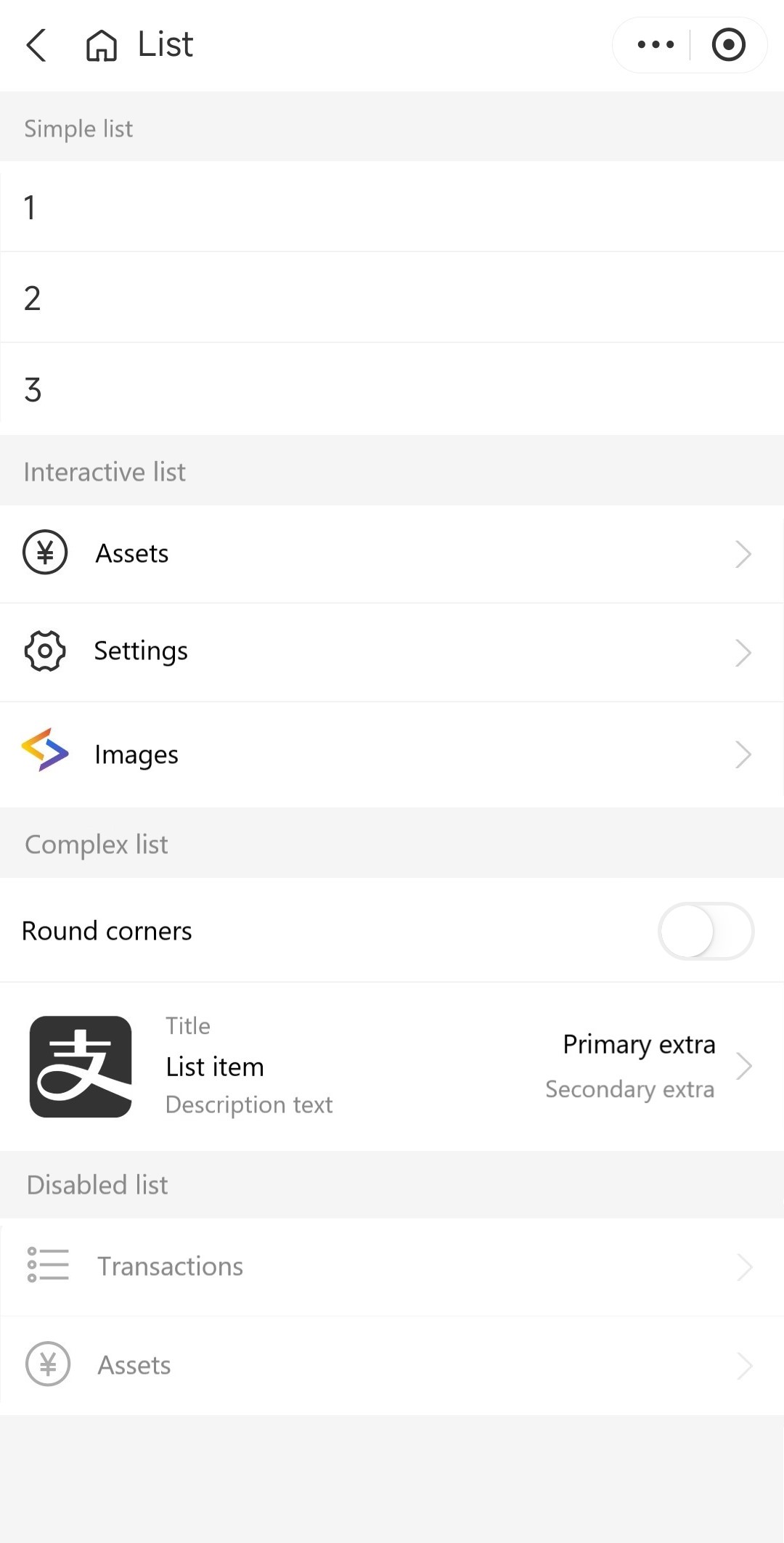
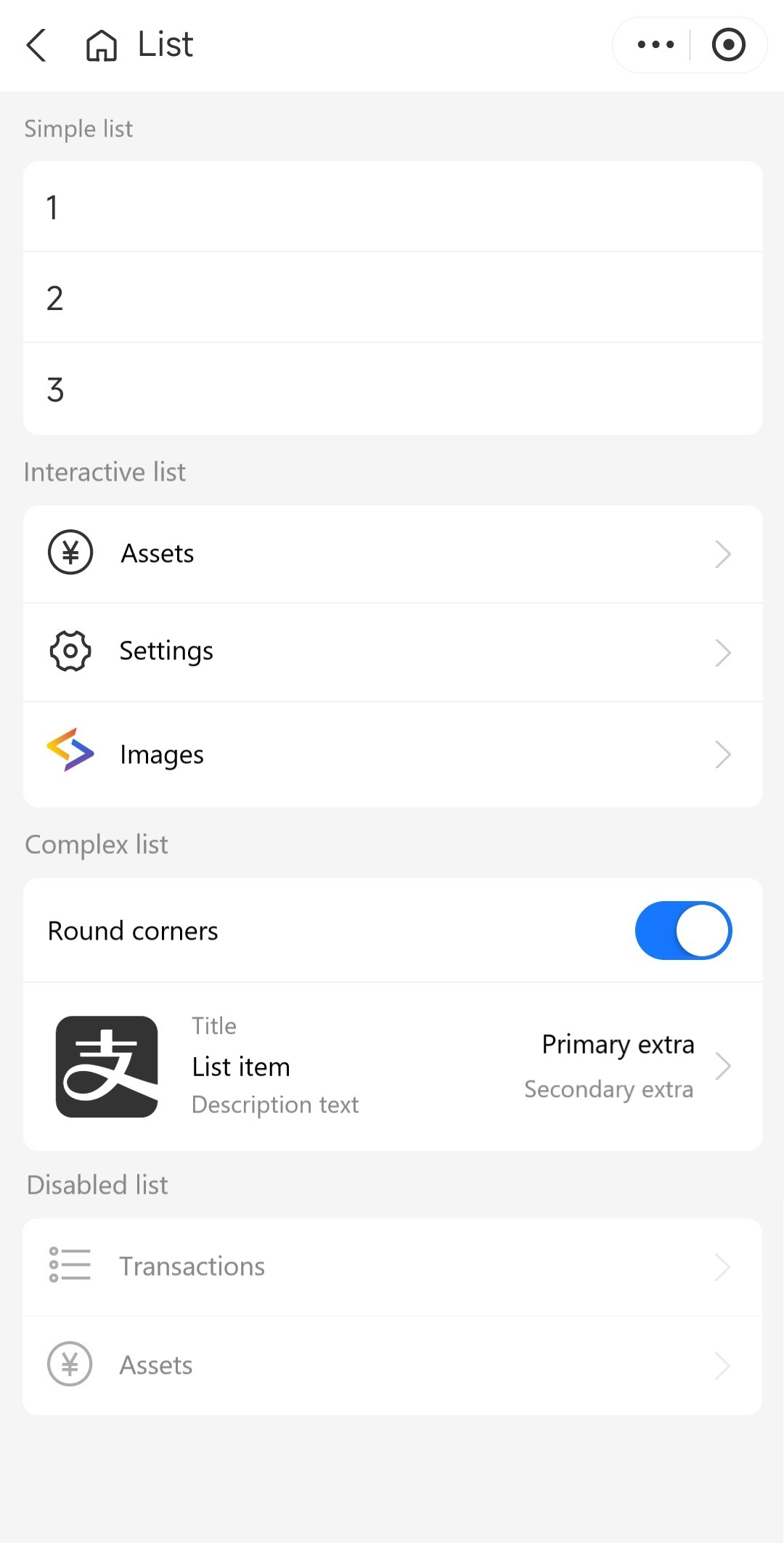
The following table shows two images that have the same set of lists that are wrapped by containers with square corners and rounded corners respectively:
Square-cornered containers | Rounded-cornered containers |
|
|
Attributes
List
Attribute | Data type | Default | Description |
className | String | N/A | The class name for the List component. |
style | String | N/A | The style for the List component. |
header | String, Slot | N/A | The header content of the list. |
footer | String, Slot | N/A | The footer content for the list. |
radius | Boolean |
| Whether to apply rounded corners to the list. |
ListItem
Attribute | Data type | Default | Description |
className | String | N/A | The class name for the ListItem component. |
style | String | N/A | The style for the ListItem component. |
image | String | N/A | The image on the left side of the list item. |
arrow | String, Boolean |
| The arrow icon on the right side of the list item. Valid values are:
|
title | String, Slot | N/A | The title above the list item. |
brief | String, Slot | N/A | The description text under the list item. |
extra | String, Slot | N/A | The primary extra information on the right side of the list item. It is placed above the extraBrief content. |
extraBrief | String, Slot | N/A | The secondary extra information on the right side of the list item. It is placed under the extra content. |
disabled | Boolean |
| Whether the list item is disabled for interaction. |
radius | Boolean |
| Whether to apply rounded corners to the list items. |
showDivider | Boolean |
| Whether to show dividers between list items. |
catchTap | EventHandle | N/A | The callback function that is triggered when the list item is tapped (non-bubbling). |
onTap | EventHandle | N/A | The callback function that is triggered when the list item is tapped. |
Sample code
The following code demonstrates how to create the lists that are shown in User experience:
.axml
<view>
  <ant-list
    header="Simple list"
    radius="{{ radius }}">
    <ant-list-item>1</ant-list-item>
    <ant-list-item>2</ant-list-item>
    <ant-list-item>3</ant-list-item>
  </ant-list>
  <ant-list
    header="Interactive list"
    radius="{{ radius }}">
    <ant-list-item
      image="PayCircleOutline"
      arrow="right"
      onTap="handleTap"
      data-info="Assets">
      Assets
    </ant-list-item>
    <ant-list-item
      image="SetOutline"
      arrow="right"
      onTap="handleTap"
      data-info="Settings">
      Settings
    </ant-list-item>
    <ant-list-item
      image="https://gw.alipayobjects.com/mdn/rms_ce4c6f/afts/img/A*XMCgSYx3f50AAAAAAAAAAABkARQnAQ"
      arrow="right"
      onTap="handleTap"
      data-info="Images">
      Images
    </ant-list-item>
  </ant-list>
  <ant-list
    radius="{{ radius }}"
    header="Complex list">
    <ant-list-item>
      Round corners
      <ant-switch
        slot="extra"
        checked="{{ radius }}"
        onChange="handleSetRadius" />
    </ant-list-item>
    <ant-list-item
      title="Title"
      brief="Description text"
      extra="Primary extra"
      extraBrief="Secondary extra"
      onTap="handleTap"
      data-info="List item"
      arrow="right">
      List item
      <ant-icon
        slot="image"
        type="AlipaySquareFill"
        style="font-size: 64px" />
    </ant-list-item>
  </ant-list>
  <ant-list
    radius="{{ radius }}"
    header="Disabled list">
    <ant-list-item
      disabled
      image="UnorderedListOutline"
      arrow="right"
      data-info="Transactions">
      Transactions
    </ant-list-item>
    <ant-list-item
      disabled
      image="PayCircleOutline"
      arrow="right"
      data-info="Assets">
      Assets
    </ant-list-item>
  </ant-list>
</view>
.js
Page({
  data: {
    radius: false,
  },
  handleTap(e) {
    my.alert({
      title: 'onTap',
      content: e.currentTarget.dataset.info,
    });
    console.log(e);
  },
  handleSetRadius(checked) {
    this.setData({
      radius: checked,
    });
  },
});
.json
{
  "defaultTitle": "List",
  "usingComponents": {
    "ant-list": "antd-mini/es/List/index",
    "ant-list-item": "antd-mini/es/List/ListItem/index",
    "ant-icon": "antd-mini/es/Icon/index",
    "ant-switch": "antd-mini/es/Switch/index"
  }
}
