Customize alert view
The super app can customize the alert view appearance in mini programs to ensure a consistent user interface. These views notify users about important information, warnings, or confirmations. They support the following optional elements on iOS:
- A title
- A message (might support configurable alignment)
- One or two action buttons
For scenarios where the alert view appears, refer to Alert view appearance scenarios. To customize alerts, the super app must implement the GRVAlertDelegate protocol. This topic covers the default user experience, implementation steps, and protocol details.
Default user experience
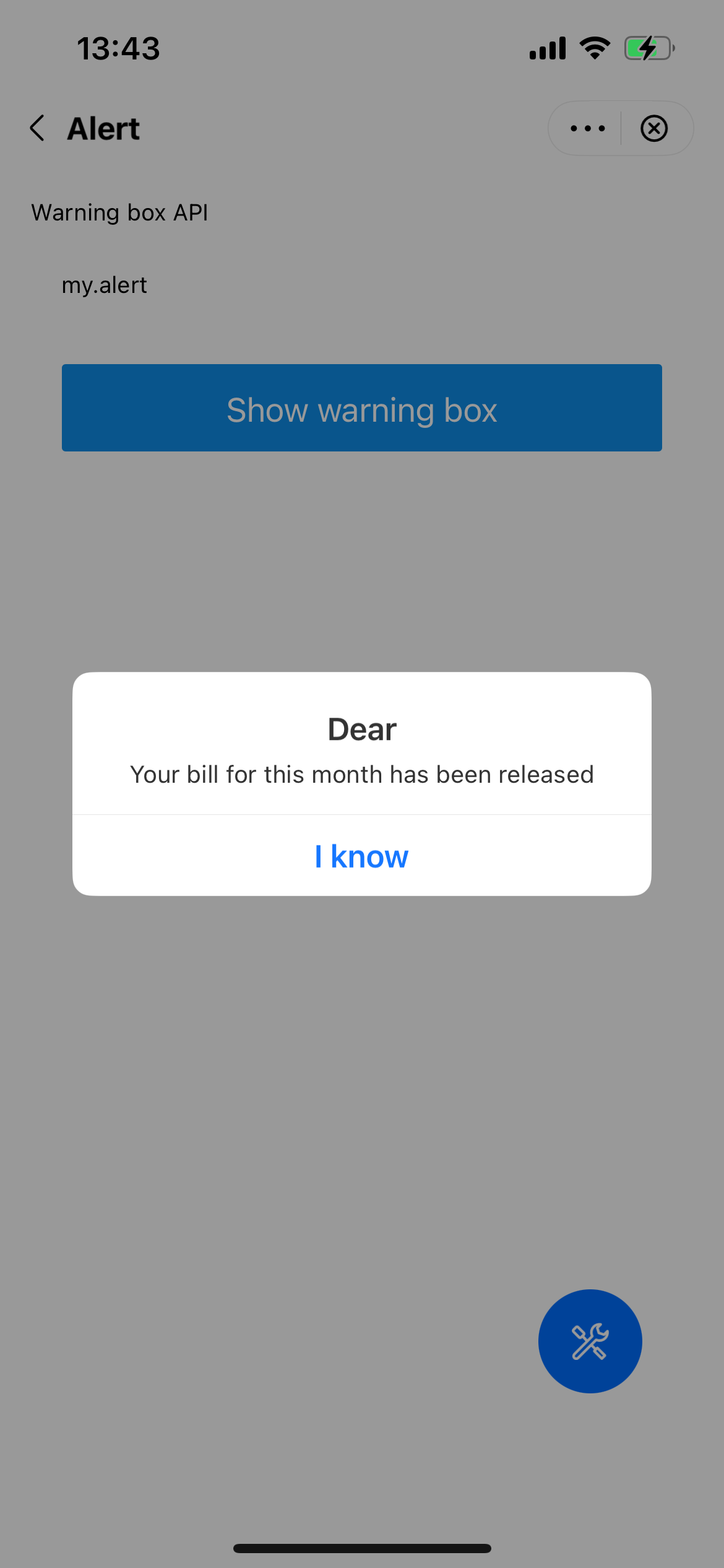
By default, an alert view appears as a centered popup with a white background. It displays a title in black text at the top, a message in black text in the middle, and action buttons with blue text at the bottom. The following image shows a UI example of an alert view with a single button:

Procedure
To customize the alert view, take the following two steps:
Step 1: Implement the GRVAlertDelegate protocol
Define a class that implements the GRVAlertDelegate protocol. Within the class, implement the showAlert method to customize an alert view. Refer to the following code for a sample implementation. For more information about the protocol and the method, refer to GRVAlertDelegate.
class DemoAlertDelegateImpl: NSObject, GRVAlertDelegate {
    func showAlert(
        with param: GRVAlertParam,
        currentViewController: UIViewController,
        positiveAction: GRVAlertActionBlock,
        negativeAction: GRVAlertActionBlock,
        cancelAction: GRVAlertActionBlock
    ) {
        // Implement the logic to build a custom alert view
    }
}
Step 2: Configure alertDelegate
After initializing the SDK, create an instance of GRVExtensionDelegate and assign the implementation (for example, DemoAlertDelegateImpl in the sample) to the alertDelegate property of the delegate's uiProvider. Refer to the following sample configuration code:
let extensionDelegate = GRVExtensionDelegate()
extensionDelegate.uiProvider.alertDelegate = DemoAlertDelegateImpl()
Structures
GRVAlertDelegate protocol
The GRVAlertDelegate protocol defines a method for the super app to customize an alert view, which the SDK then calls to render the custom view. Refer to the following code for the protocol definition:
@protocol GRVAlertDelegate <NSObject>

@required

- (void)showAlertWithParam:(GRVAlertParam *)param
      currentViewController:(UIViewController *)currentViewController
             positiveAction:(GRVAlertActionBlock)positiveAction
             negativeAction:(GRVAlertActionBlock)negativeAction
               cancelAction:(GRVAlertActionBlock)cancelAction;

@end
Based on the definition, this protocol provides the following method:
Method | Description |
showAlertWithParam:currentViewController:positiveAction:negativeAction:cancelAction: | Called by the SDK to render a custom alert view. For more information, refer to |
showAlertWithParam:currentViewController:positiveAction:negativeAction:cancelAction: method
Parameters
The method has the following input parameters:
Parameter | Data type | Required | Description |
param | GRVAlertParam | Yes | An object that contains the configuration for the custom alert view. For more information, refer to |
currentViewController | UIViewController | Yes | A reference to the view controller that displays and manages the alert view. |
positiveAction | Function | Yes | A callback to execute when the user taps a positive button (e.g., OK). |
negativeAction | Function | Yes | A callback to execute when the user taps a negative button (e.g., Cancel). |
cancelAction | Function | Yes | A callback to execute when the user taps the background to dismiss the alert. |
GRVAlertParam class
The GRVAlertParam class defines properties to customize the alert's appearance and behavior. Refer to the following definition for more information:
typedef void (^GRVAlertActionBlock)(NSString *_Nullable);

NS_ASSUME_NONNULL_BEGIN

@interface GRVAlertParam : NSObject
@property(nonatomic, copy)NSString *title;
@property(nonatomic, copy)NSString *message;
@property(nonatomic, copy)NSString *align;
@property(nonatomic, copy)NSString *positiveString;
@property(nonatomic, copy)NSString *negativeString;
@property(nonatomic, copy)NSString *positiveTextColor;
@property(nonatomic, copy)NSString *negativeTextColor;
@property(nonatomic, assign)BOOL cancelable;

@end
The following table lists the property details of this class:
Property | Data type | Required | Description |
title | NSString | No | The title of the alert view. |
message | NSString | Yes | The message of the alert view. |
align | NSString | No | The message alignment. Valid values are:
|
positiveString | NSString | No | Text for the positive button (e.g., OK). |
negativeString | NSString | No | Text for the negative button (e.g., Cancel). |
positiveTextColor | NSString | No | The color of the positive button text in hexadecimal RGB or ARGB format (e.g., |
negativeTextColor | NSString | No | The color of the negative button text in hexadecimal RGB or ARGB format (e.g., |
cancelable | BOOL | No | Whether the alert can be cancelable. Valid values are:
|
Appendices
Alert view appearance scenarios
An alert view appears in the following scenarios:
Category | Scenarios |
JSAPI calls | my.alert call |
my.confirm call | |
Permission failure | User denies location permission |
Failed location access due to denied permission | |
Permission guide | Guiding users to enable permissions in general scenarios |
Guiding users to enable camera access | |
Guiding users to enable album access | |
Guiding users to enable contacts access |