

Customize title bar right-side buttons
The super app can customize the appearance of title bar buttons to ensure a consistent user interface. This includes:
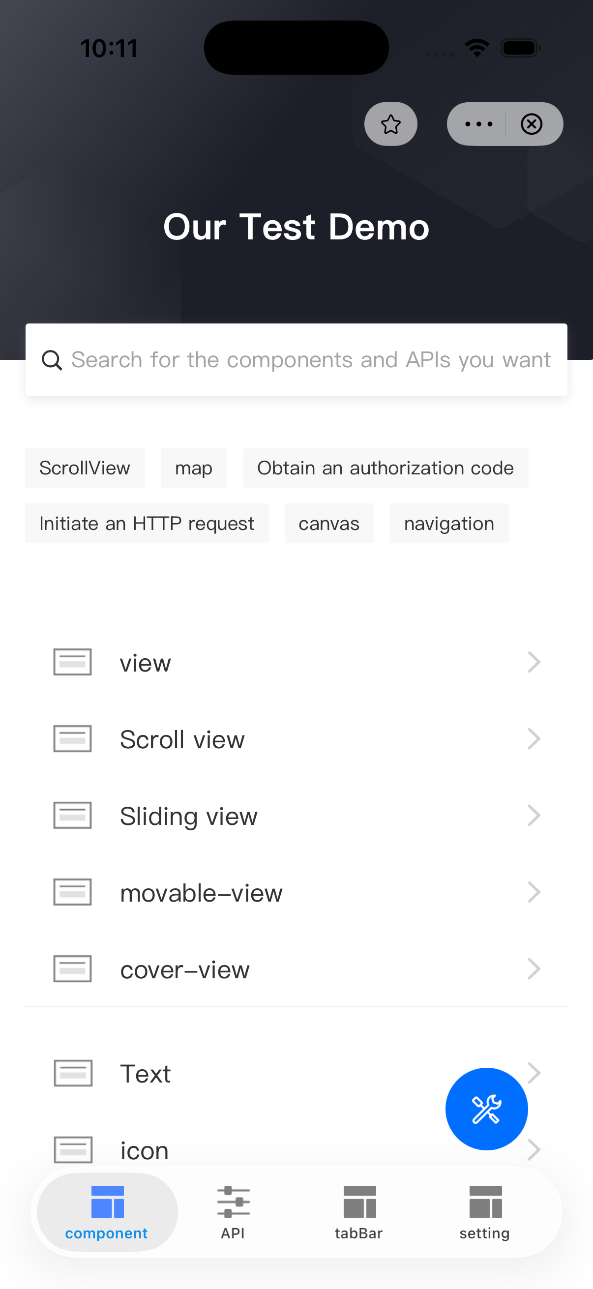
- Favorite/unfavorite button: Allows users to add or remove a mini program from their favorites.
- Capsule More/Close buttons: The More button allows users to open the bottom menu panel, and the Close button allows users to close the mini-program.
To customize these buttons, the super app must implement the GRVTitleBarInfoDelegate protocol. This topic covers the default user experience, implementation steps, and protocol details.
Default user experience
By default, the following buttons on the title bar right-side:
- The favorite/unfavorite button is a star-shaped icon.
- The capsule More and Close buttons are iconfont icons.
Refer to the following UI examples:
Before you begin
To customize the title bar buttons, ensure that the integrated iOS IAPMiniProgram SDK meets the following version requirements:
- Favorite/unfavorite button: SDK 2.65.3 or later.
- Capsule More/Close buttons: SDK 2.79.0 or later.
For more information, see SDK release notes.
Procedure
To customize the title bar button, take the following two steps:
Step 1: Implement the GRVTitleBarInfoDelegate protocol
Define a class that implements the GRVTitleBarInfoDelegate protocol. Within the class, implement the getTitleBarItemInfo method to customize the title bar buttons. Refer to the following code for a sample implementation.
For more information about the protocol and the method, refer to GRVTitleBarInfoDelegate.
class DemoTitleBarInfoDelegate: NSObject, GRVTitleBarInfoDelegate{
    func getTitleBarItemInfo(_ type:GRVTitleBarItemType, status status:GRVTitleBarItemStatus) -> GRVTitleBarItemInfo {

        let titleBarInfo = GRVTitleBarItemInfo()
        titleBarInfo.itemType = type
        switch type {
        case .collect:
            if status == .collectOn {
                titleBarInfo.iconPath = "collect_on_icon"
                titleBarInfo.darkIconPath = "collect_on_icon_dark"
            } else {
                titleBarInfo.iconPath = "collect_off_icon"
                titleBarInfo.darkIconPath = "collect_off_icon_dark"
            }
            return titleBarInfo
        case .more:
            titleBarInfo.iconPath = "custom_more_icon"
            titleBarInfo.darkIconPath = "custom_more_icon_dark"
            return titleBarInfo
        case .close:
            titleBarInfo.iconPath = "custom_close_icon"
            titleBarInfo.darkIconPath = "custom_close_icon_dark"
            return titleBarInfo
        default:
            return titleBarInfo
        }
    }
}
Step 2: Configure titleBarInfoDelegate delegate
After initializing the SDK, create an instance of GRVExtensionDelegate and assign the implementation (for example, DemoTitleBarInfoDelegate in the sample) to the titleBarInfoDelegate property of the delegate's uiProvider. Refer to the following sample configuration code:
let extensionDelegate = GRVExtensionDelegate()
extensionDelegate.uiProvider.titleBarInfoDelegate = DemoTitleBarInfoDelegate()
Structures
GRVTitleBarInfoDelegate protocol
TheGRVTitleBarInfoDelegate protocol defines a method for the super app to customize the title bar button, which the SDK then calls to render the custom button.
Refer to the following code for the protocol definition:
@protocol GRVTitleBarInfoDelegate<NSObject>

- (GRVTitleBarItemInfo *)getTitleBarItemInfo:(GRVTitleBarItemType)type status:(GRVTitleBarItemStatus)status;

@end
The following table lists the details of the defined method:
Method | Description |
getTitleBarItemInfo:type:status: | Called by the SDK to obtain and render the custom title bar button. For more information, refer to |
getTitleBarItemInfo:type:status: method
Parameters
This method has the following input parameters:
Parameter | Data type | Required | Description |
type | Yes | The button type. Valid values are:
For details, see | |
status | Yes | The button status. Valid values are:
For details, see |
GRVTitleBarItemType
typedef NSString *GRVTitleBarItemType NS_TYPED_EXTENSIBLE_ENUM;
FOUNDATION_EXPORT GRVTitleBarItemType const GRVTitleBarItemTypeCollect;
FOUNDATION_EXPORT GRVTitleBarItemType const GRVTitleBarItemTypeMore;
FOUNDATION_EXPORT GRVTitleBarItemType const GRVTitleBarItemTypeClose;
GRVTitleBarItemStatus
typedef NSString *GRVTitleBarItemStatus NS_TYPED_EXTENSIBLE_ENUM;
FOUNDATION_EXPORT GRVTitleBarItemStatus const GRVTitleBarItemStatusNone;
FOUNDATION_EXPORT GRVTitleBarItemStatus const GRVTitleBarItemStatusCollectOn;
FOUNDATION_EXPORT GRVTitleBarItemStatus const GRVTitleBarItemStatusCollectOff;
Return value
The method returns an instance of the GRVTitleBarItemInfo object. Return nil to use the default icons. Refer to the following code for the object definition:
@interface GRVTitleBarItemInfo : NSObject

@property(nonatomic,copy) NSString *iconPath;
@property(nonatomic,copy) NSString *darkIconPath;
@property(nonatomic,copy) GRVTitleBarItemType itemType;
- (GRVTitleBarItemInfo *)rebuild;
@end
The object contains the following properties for the super app to customize the title bar buttons:
Property | Data type | Required | Description |
iconPath | String | Yes | The icon path for light mode. |
darkIconPath | String | No | The icon path for dark mode. |
itemType | String | Yes | The button type. Note: If not provided, the custom icon for this button will not work. |