Customize action sheets
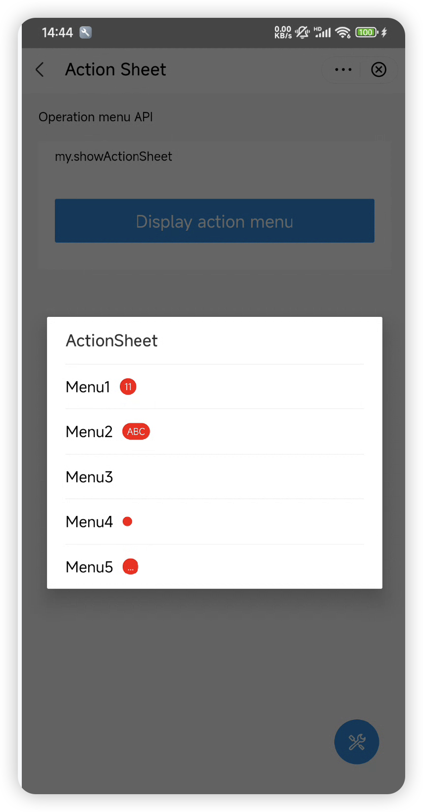
The super app can customize the appearance of action sheets within mini programs to ensure a consistent user interface. An action sheet appears when a mini program invokes the my.showActionSheet JSAPI, presenting users with a set of contextual actions related to a specific item or task. It supports the following elements on Android:
- A title (displays if provided by the mini program)
- Multiple action options
- Badges around action options (display if provided by the mini program)
Default user interface
By default, an action sheet appears as a centered pop-up. It displays the title at the top, followed by a list of action options, with optional red badges on their right sides. Users can cancel their selection using the system back button (either a virtual button or a left swipe). The following figure shows an example of the default UI:

Before you begin
To customize the user interface for action sheets, ensure that the integrated Android IAPMiniProgram SDK is version 2.67.0 or later. For more information, see SDK release notes.
Procedure
To customize action sheets, take the following two steps:
Step 1: Implement GriverActionSheetExtension
Create a class that implements the GriverActionSheetExtension interface. Within the class, override the showActionSheet method to customize an action sheet. Refer to the following code for a sample implementation. For more information about the interface and its method, refer to GriverActionSheetExtension.
class CustomActionSheetImpl : GriverActionSheetExtension {

    override fun showActionSheet(
        param: GriverActionSheetParam,
        resultCallback: GriverActionSheetResultCallback
    ) {
        // Implement the logic to build a custom action sheet
    }
}
Step 2: Register the implementation class
After initializing the SDK, call the registerExtension API to register the implementation class (for example, CustomActionSheetImpl in the sample) with the SDK. Refer to the following sample registration code:
Griver.registerExtension(GriverExtensionManifest(
    GriverActionSheetExtension::class.java,
    CustomActionSheetImpl()
)
Interface
GriverActionSheetExtension
The GriverDatePickerExtension interface defines a method for the super app to customize an action sheet, which the SDK then calls to render the custom sheet. Refer to the following code for the interface definition:
interface GriverActionSheetExtension : GriverExtension {

    fun showActionSheet(
        param: GriverActionSheetParam,
        callback: GriverActionSheetResultCallback
    )
}
The following table lists the details of the defined method:
Method | Required | Description |
showActionSheet | Yes | Called by the SDK to render a custom action sheet. For more information, refer to |
showActionSheet
The showActionSheet method has the following input parameters whose values are passed by the SDK:
Parameter | Data type | Required | Description |
param | GriverActionSheetParam class | Yes | An object that contains the configuration for a custom action sheet. |
callback | Yes | The callback that handles user selection or cancellation. |
GriverActionSheetParam
The definition of the GriverActionSheetParam class is as follows:
data class GriverActionSheetParam(
    val activityWeakReference: WeakReference<Activity>,
    val title: String?,
    val itemColor: String,
    val destructiveBtnIndex: Int?,
    val items: List<GriverActionSheetItem>
        ) : Serializable
The following table lists the parameter details of this class:
Parameter | Data type | Required | Description |
activityWeakReference | WeakReference<Activity> | Yes | A weak reference to |
title | String? | No | The title of the action sheet. Specified only if provided by the mini program. |
items | List<GriverActionSheetItem> | Yes | A list of available actions on the action sheet. |
itemColor | String | Yes | The color of the action text in hexadecimal RGB or ARGB format (e.g., |
destructiveBtnIndex | Int? | No | The index (starting from Note: For the destructive action style, it is recommended to highlight the action text in red to align with the my.showActionSheet JSAPI specification. |
GriverActionSheetItem
The GriverActionSheetItem class is defined as follows:
data class GriverActionSheetItem(
    val itemText: String,
    val badgeType: GriverBadgeEnum = GriverBadgeEnum.NONE,
    val badgeText: String?
) : Serializable
The following table lists the parameter details of this class:
Parameter | Data type | Required | Description |
itemText | String | Yes | The text for the action. |
badgeType | GriverBadgeEnum class | Yes | The type of badge displayed next to the action. For the definition of the
For visual illustrations of different badges, refer to the figure in Default user interface. Note: It is recommended to create badges based on the value description to align with the my.showActionSheet JSAPI specification. |
badgeText | String | No | The text displayed within a badge. Specified only if badgeType is |
GriverBadgeEnum class
enum class GriverBadgeEnum(private val value: String) {
    NONE("none"),
    POINT("point"),
    NUM("num"),
    TEXT("text"),
    MORE("more");

    // Retrieve the string equivalent of the enum constant
    fun getValue(): String = value

    companion object {
        /**
         * Retrieve the corresponding enum instance for a given string value.
         * If the value does not match any enum, return the default value: NONE.
         */
        fun fromValue(value: String): GriverBadgeEnum {
            return values().find { it.value == value } ?: NONE
        }
    }
}
GriverActionSheetResultCallback
Method | Required | Description |
onSuccess | No | Execute this callback if the user completes a selection, returning the selected action. For more information about the return value, refer to |
onCancel | No | Execute this callback if the user dismisses the action sheet without a selection. |
onSuccess
Parameter | Data type | Required | Description |
selectedIndex | int | Yes | The index (starting from 0) of the action selected by the user in the items list. |