Customize alert dialogs
The super app can customize the alert dialog appearance in mini programs to ensure a consistent user interface. These dialogs notify users about important information, warnings, or confirmations. They support the following optional elements on Android:
- A title
- A message (might support configurable alignment)
- One or two action buttons
For scenarios where alert dialogs appear, refer to Alert dialog appearance scenarios. To customize alert dialogs, the super app must implement the GriverDialogExtension interface. This topic covers the default user experience, implementation steps, and interface details.
Default user experience
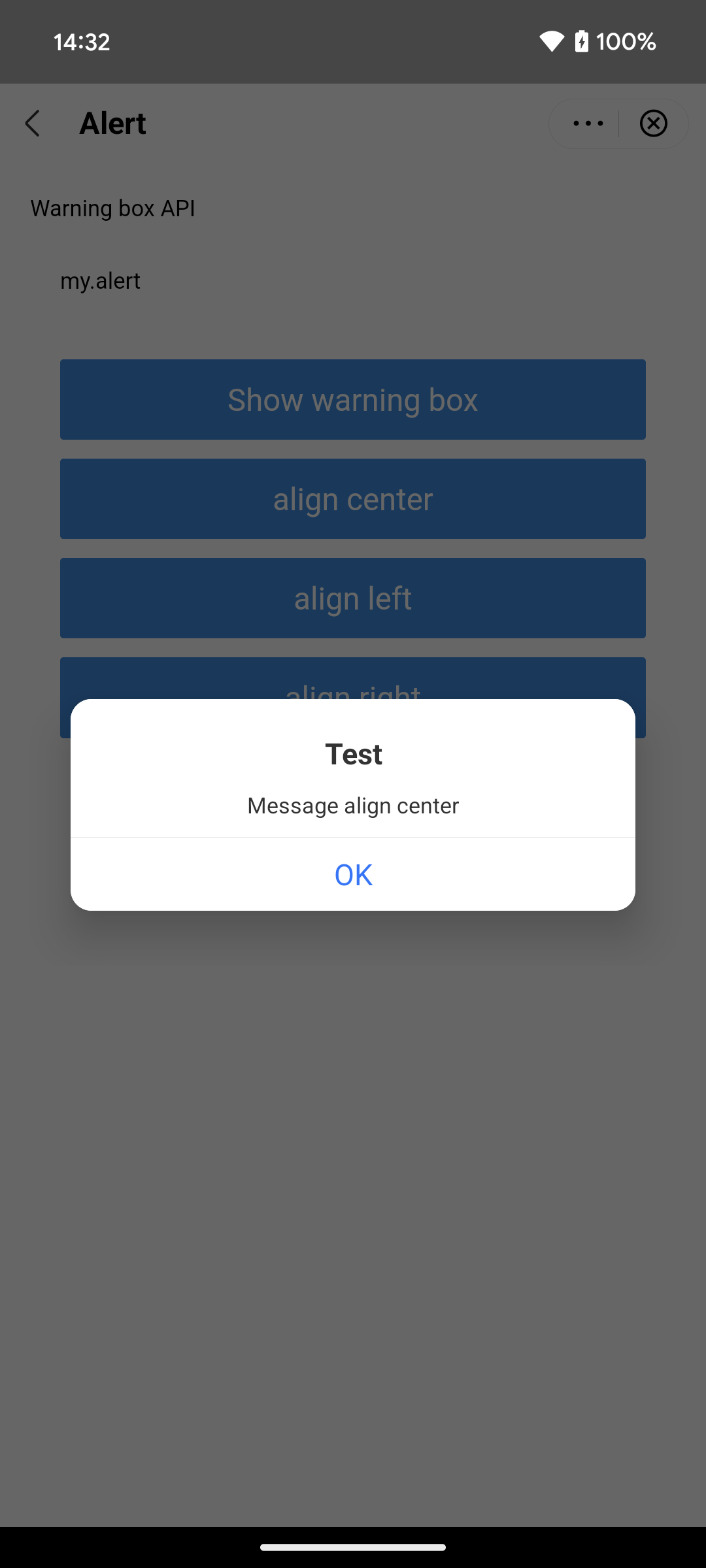
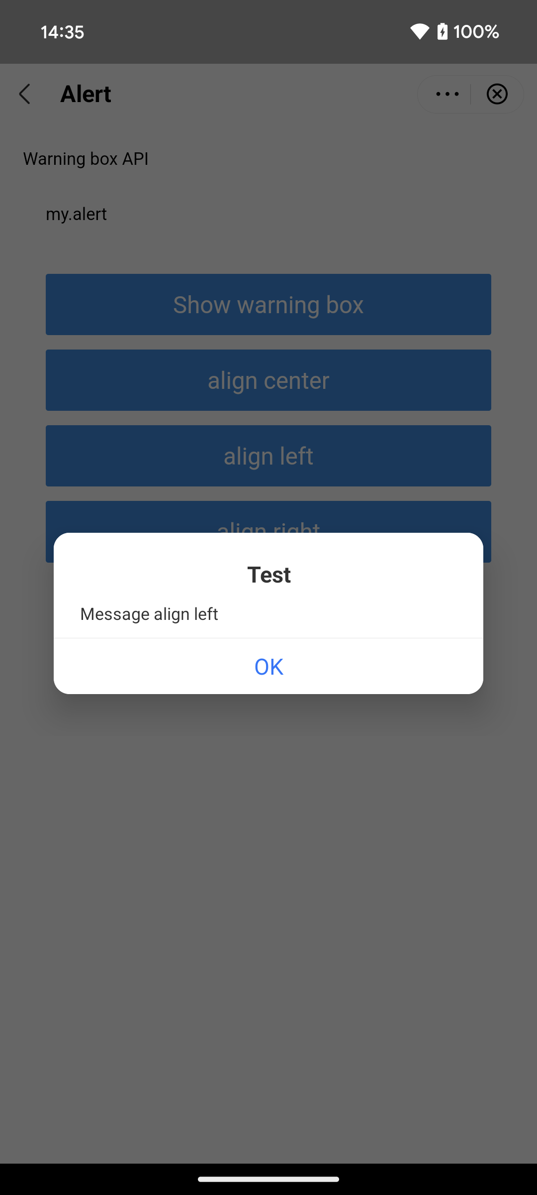
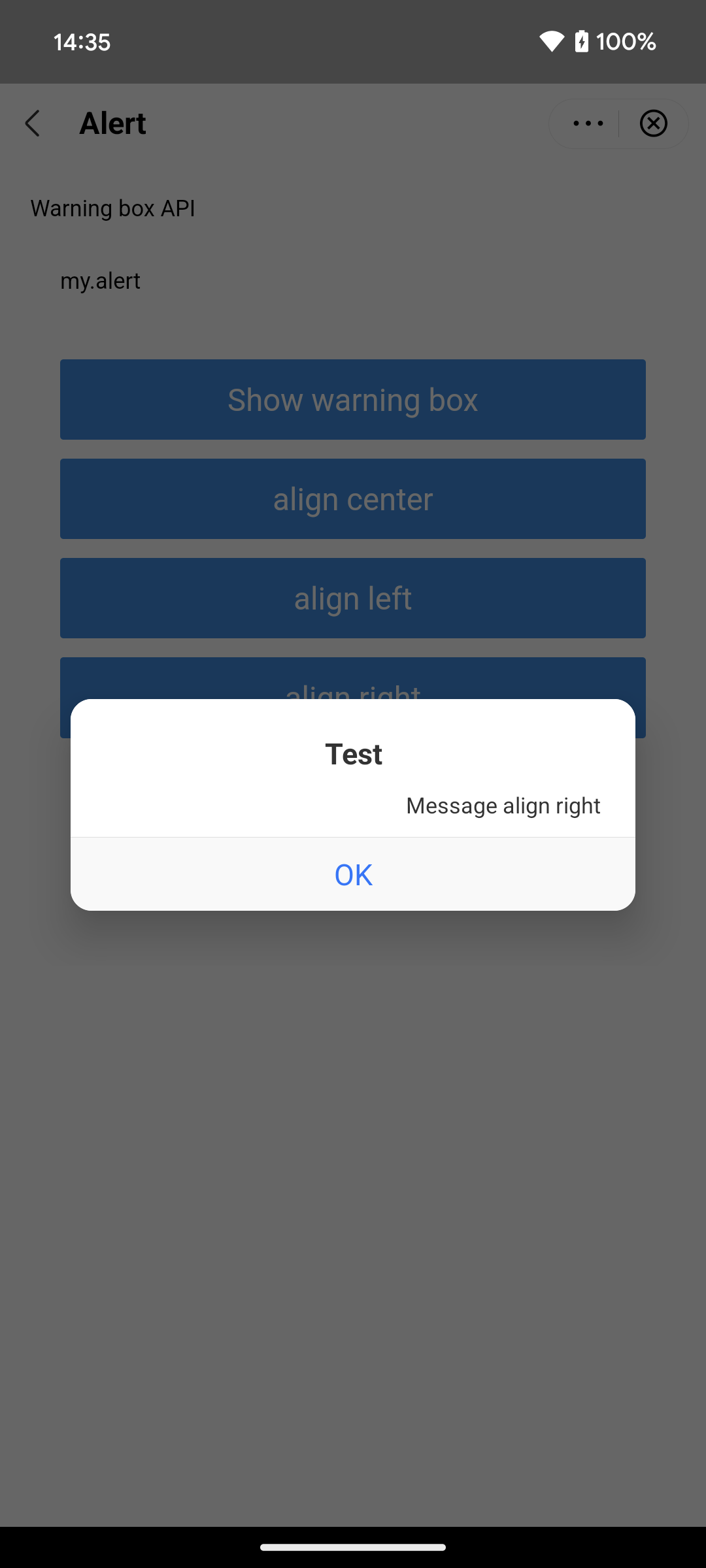
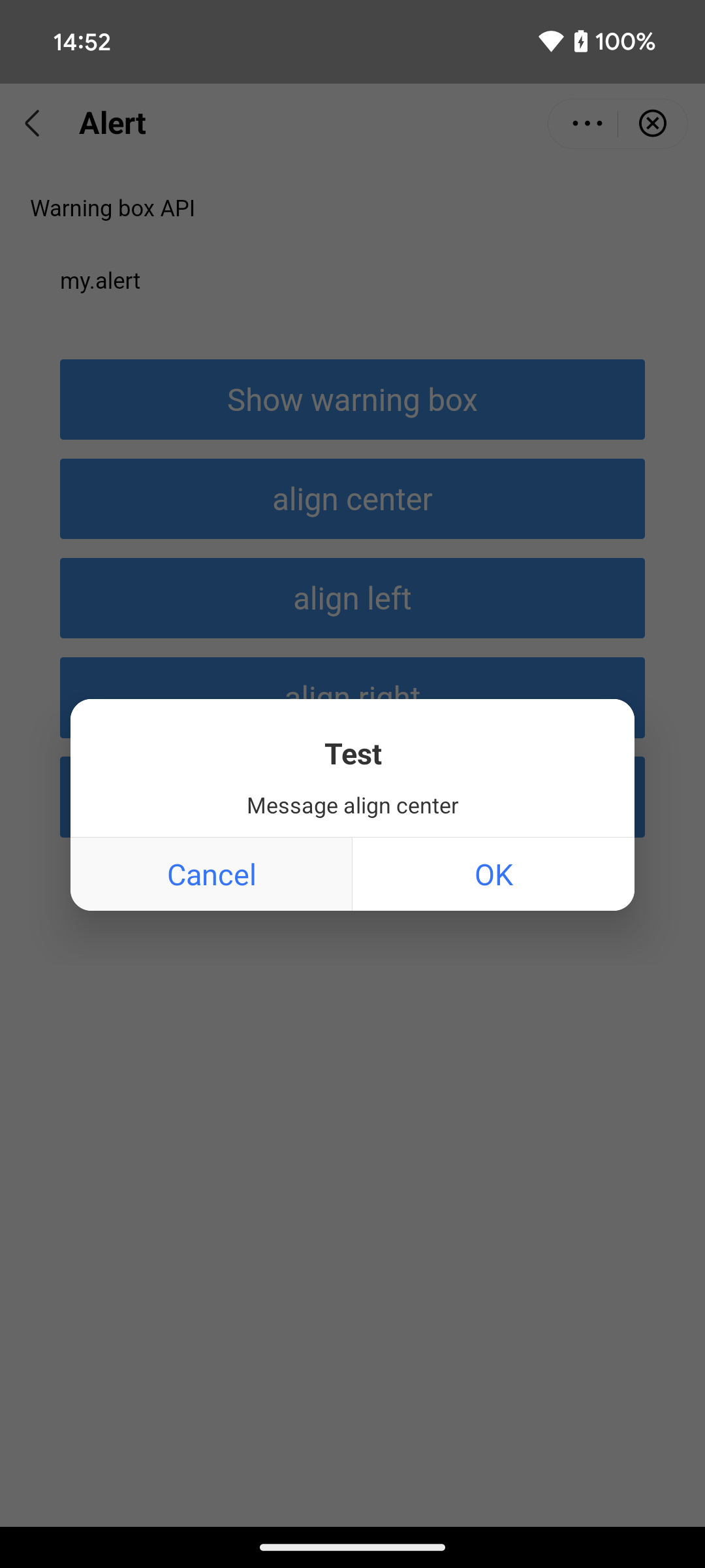
By default, an alert dialog appears as a centered popup with a white background. It displays a title in black text at the top, a message in black text in the middle, and action buttons with blue text at the bottom. The following table shows some UI examples of different alert dialogs:
Alert with single button (center-aligned) | Alert with single button (left-aligned) | Alert with single button (right-aligned) | Alert with two buttons (center-aligned) |
|
|
|
|
Procedure
To customize alert dialogs, take the following two steps:
Step 1: Implement the GriverDialogExtension interface
Create a class that implements the GriverDialogExtension interface. Within the class, override the createDialog and applyShow methods to customize an alert dialog. Refer to the following code for a sample implementation. For more information about the interface and the method, refer to GriverDialogExtension.
class CustomDialogExtensionImpl : GriverDialogExtension {
    override fun createDialog(activity: Activity, createParam: CreateDialogParam?): Dialog? {
        return null;
        // Implement the logic to build a custom alert dialog
    }

    override fun applyShow(dialog: Dialog?, createDialogParam: CreateDialogParam?) {
        // Implement logic to further customize the dialog
    }
}
Step 2: Register the implementation class
After initializing the SDK, call the registerExtension API to register the implementation class (for example, CustomDialogExtensionImpl in the sample) with the SDK. Refer to the following sample registration code:
IAPConnect.init(application, initConfig, object : InitCallback {
    fun onSuccess() {
        //···
        Griver.registerExtension(
            GriverExtensionManifest(
                GriverDialogExtension::class.java,
                CustomDialogExtensionImpl()
            )
        )
    }
})
Structures
GriverDialogExtension interface
The GriverDialogExtension interface defines methods for the super app to customize an alert dialog, which the SDK then calls to render the custom dialog. Refer to the following code for the interface definition:
interface GriverDialogExtension : GriverExtension {

    fun createDialog(activity: Activity?, createParam: CreateDialogParam?): Dialog?

    fun applyShow(dialog: Dialog?, createDialogParam: CreateDialogParam?)
}
Based on the definition, this interface provides the following methods:
Method | Description |
createDialog | Called by the SDK to create a custom dialog instance. For more information, refer to |
applyShow | Called by the SDK after the dialog is shown to enable further customization because some elements can be obtained only after dialog creation. For more information, refer to |
createDialog method
Parameters
The createDialog method has the following input parameters:
Parameter | Data type | Required | Description |
activity | Activity | No | The |
createParam | CreateDialogParam | No | An object that contains the configuration for the custom alert dialog. For more information, refer to |
applyShow method
Parameters
The applyShow method has the following input parameters:
Parameter | Data type | Required | Description |
dialog | Dialog | No | The dialog instance created by the |
createDialogParam | CreateDialogParam | No | An object that contains the configuration for the custom alert dialog. For more information, refer to |
CreateDialogParam class
The CreateDialogParam class includes the following parameters:
Parameter | Data type | Required | Description |
title | String | No | The title of the alert dialog. |
message | String | No | The message of the alert dialog. |
align | String | No | The message alignment. Valid values are:
|
positiveString | String | No | Text for the positive button (e.g., OK). |
negativeString | String | No | Text for the negative button (e.g., Cancel). |
positiveTextColor | String | No | The color of the positive button text in hexadecimal RGB or ARGB format (e.g., |
negativeTextColor | String | No | The color of the negative button text in hexadecimal RGB or ARGB format (e.g., |
positiveListener | DialogInterface.OnClickListener | No | The listener for positive button clicks. When the positive button is clicked, call the
|
negativeListener | DialogInterface.OnClickListener | No | The listener for negative button clicks. When the negative button is clicked, call the
|
cancelListener | DialogInterface.OnCancelListener | No | The listener for dialog cancellation. When the dialog is canceled by clicking the back key, call the |
cancelable | Boolean | No | Indicate whether the dialog is cancelable by clicking the back key (
|
Appendices
Alert dialog appearance scenarios
An alert dialog appears when a mini program invokes one of the following JSAPIs and the associated scenarios:
Type | JSAPI name | Scenarios |
SDK-provided JSAPIs | my.alert | Every call |
my.confirm | Every call | |
my.saveImage | Confirming image save | |
my.addPhoneContact | Confirming contact save | |
my.showAuthGuide | Requesting permissions | |
my.chooseImage | User denies camera or storage access | |
my.chooseVideo | User denies camera or storage access | |
HTML5 JSAPIs | window.alert | Every call |
window.confirm | Every call | |
window.prompt | Every call |


