Customize date/time picker
The super app can customize the appearance of the date/time picker within mini programs to ensure a consistent user interface. The picker appears when mini programs invoke the my.datePicker JSAPI, allowing users to provide date/time inputs more efficiently. It is rendered in one of the following three formats on Android:
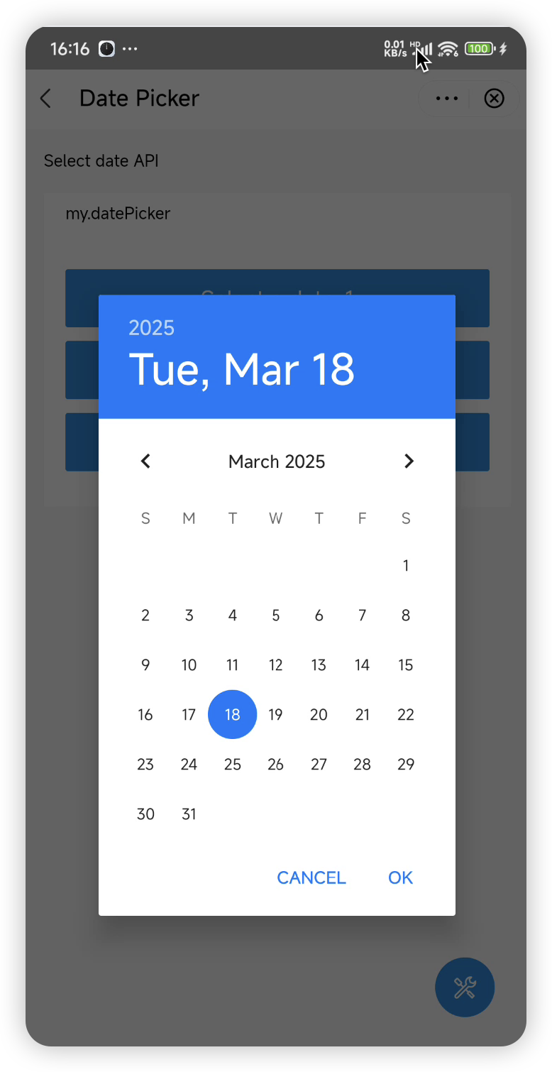
- Date picker: Enables users to select a date.
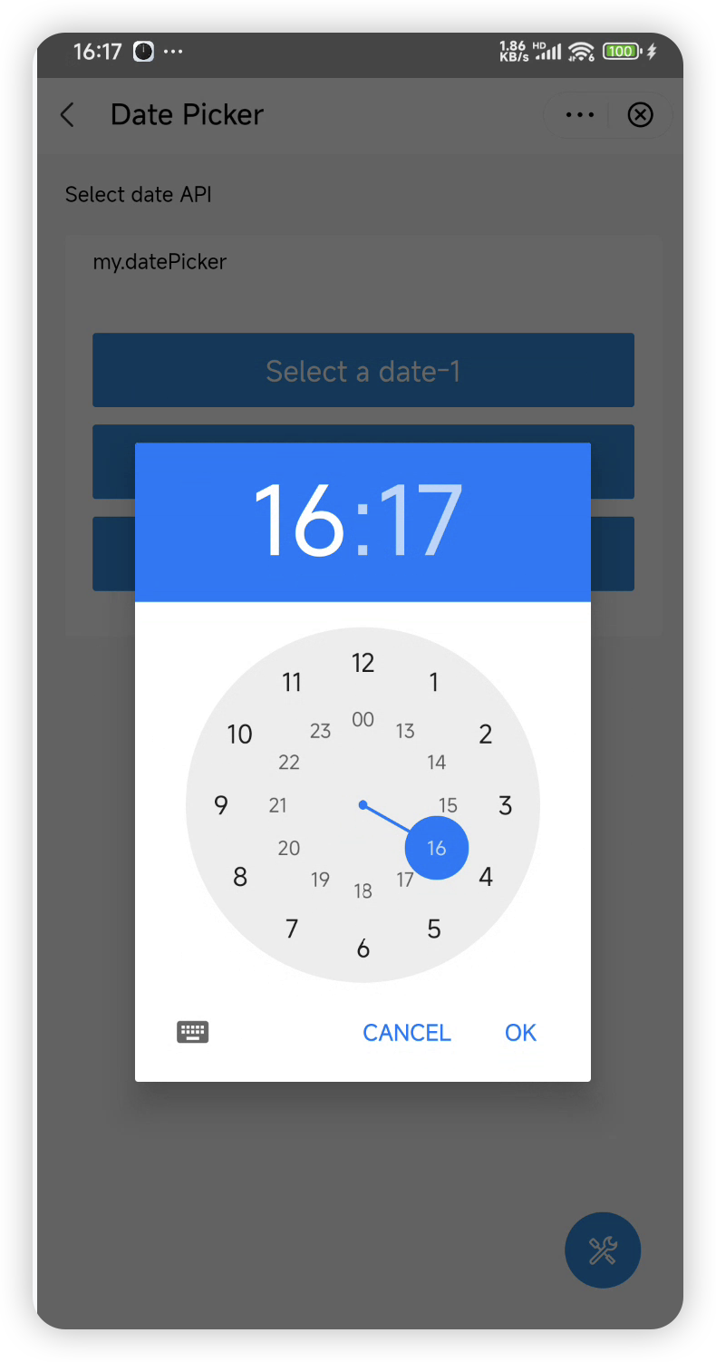
- Time picker: Enables users to select a time.
- Date and time picker: Displays a date picker and a time picker sequentially, allowing users to first select a date and then a time.
Default user interface
The following table shows the descriptions and UI examples of the default pickers:
Date picker | Time picker | |
Description | A calendar-style UI for selecting the year, month, and day. | A clock-style UI for selecting the hour and minute. |
UI example |
|
|
Before you begin
To customize the user interface for a date/time picker, ensure that the integrated Android IAPMiniProgram SDK is version 2.65.1 or later. For more information, see SDK release notes.
Procedure
To customize date and time pickers, take the following two steps:
Step 1: Implement GriverDatePickerExtension
Create a class that implements the GriverDatePickerExtension interface. Within the class, override both the showDate and showTime methods to customize a date picker and a time picker, respectively. Refer to the following code for a sample implementation. For more information about the interface and its methods, refer to GriverDatePickerExtension.
class CustomDatePickerExtensionImpl : GriverDatePickerExtension {

    override fun showDate(
        activityWeakReference: WeakReference<Activity>,
        currentDate: Calendar,
        startDate: Calendar?,
        endDate: Calendar?,
        resultCallback: GriverDatePickerResultCallback
    ) {
        // Implement the logic to build a custom date picker. Remember to:
        // - Use currentDate as the initial selection
        // - Apply startDate/endDate as constraints when the SDK passes its values
        // - Call resultCallback.onSuccess(selectedDate) or onCancel() based on user operation
    }

    override fun showTime(
        activityWeakReference: WeakReference<Activity>,
        currentDate: Calendar,
        startDate: Calendar?,
        endDate: Calendar?,
        resultCallback: GriverDatePickerResultCallback
    ) {
        // Implement the logic to build a custom time picker. Remember to:
        // - Use currentDate as the initial selection
        // - Apply startDate/endDate as constraints when the SDK passes its values
        // - Call resultCallback.onSuccess(selectedDate) or onCancel() based on user operation
    }
}Note: To render a date and time picker, the SDK automatically calls the
showDateandshowTimemethods sequentially. Therefore, no additional actions are required from the super app.
Step 2: Register the implementation class
After the SDK is initialized, call the registerExtension API to register the implementation class (for example, CustomDatePickerExtensionImpl in the sample) with the SDK. Refer to the following sample registration code:
IAPConnect.init(application, initConfig, object : InitCallback {
    override fun onSuccess() {
        //···
        Griver.registerExtension(GriverExtensionManifest(
            GriverDatePickerExtension::class.java,
            CustomDatePickerExtensionImpl()
        ))
    }
})
Interface
GriverDatePickerExtension
The GriverDatePickerExtension interface defines methods for the super app to customize a date/time picker, which the SDK then calls to render the custom picker. Refer to the following code for the interface definition:
interface GriverDatePickerExtension : GriverExtension {

    fun showDate(
        activityWeakReference: WeakReference<Activity>,
        currentDate: Calendar,
        startDate: Calendar?,
        endDate: Calendar?,
        resultCallback: GriverDatePickerResultCallback
    )

    fun showTime(
        activityWeakReference: WeakReference<Activity>,
        currentDate: Calendar,
        startDate: Calendar?,
        endDate: Calendar?,
        resultCallback: GriverDatePickerResultCallback
    )
}
The following table lists the details of the defined methods:
showDate
The showDate method has the following input parameters whose values are passed by the SDK:
Parameter | Data type | Required | Description |
activityWeakReference | WeakReference<Activity> | Yes | A weak reference to |
currentDate | Calendar | Yes | The pre-selected date on the date picker. If the mini program does not restrict it, the SDK passes the current date by default. |
startDate | Calendar | No | The earliest selectable date on the date picker. Specified only if restricted by the mini program. |
endDate | Calendar | No | The latest selectable date on the date picker. Specified only if restricted by the mini program. |
resultCallback | Yes | The callback that returns the user-selected date or handles cancellation. For more information, refer to |
showTime
The showTime method has the following input parameters whose values are passed by the SDK:
Parameter | Data type | Required | Description |
activityWeakReference | WeakReference<Activity> | Yes | A weak reference to |
currentDate | Calendar | Yes | The pre-selected time on the time picker. If the mini program does not restrict it, the SDK passes the current time by default. |
startDate | Calendar | No | The earliest selectable time on the time picker. Specified only if restricted by the mini program. |
endDate | Calendar | No | The latest selectable time on the time picker. Specified only if restricted by the mini program. |
resultCallback | Yes | The callback that returns the user-selected time or handles cancellation. For more information, refer to |
Appendices
GriverDatePickerResultCallback
Method | Required | Description |
onSuccess | Yes | The callback that returns the selected date or time when the user completes a selection. For more information about the return value, refer to |
onCancel | Yes | The callback that is triggered when the user cancels a date or time selection. |
onSuccess
Parameter | Data type | Required | Description |
selectedDate | Calendar | Yes | The date or time selected by the user. |

