

Customize title bar right-side buttons
The super app can customize the appearance of the title bar to ensure a consistent user interface. This includes the following title bar right-side buttons:
- Favorite/unfavorite button: Allows users to add or remove a mini program from their favorites.
- Capsule More/Close buttons: The More button allows users to open the bottom menu panel, and the Close button allows users to close the mini program.
To customize these button, the super app must implement the TitleBarInfoExtension interface. This topic covers the default user experience, implementation steps, and interface details.
Default user experience
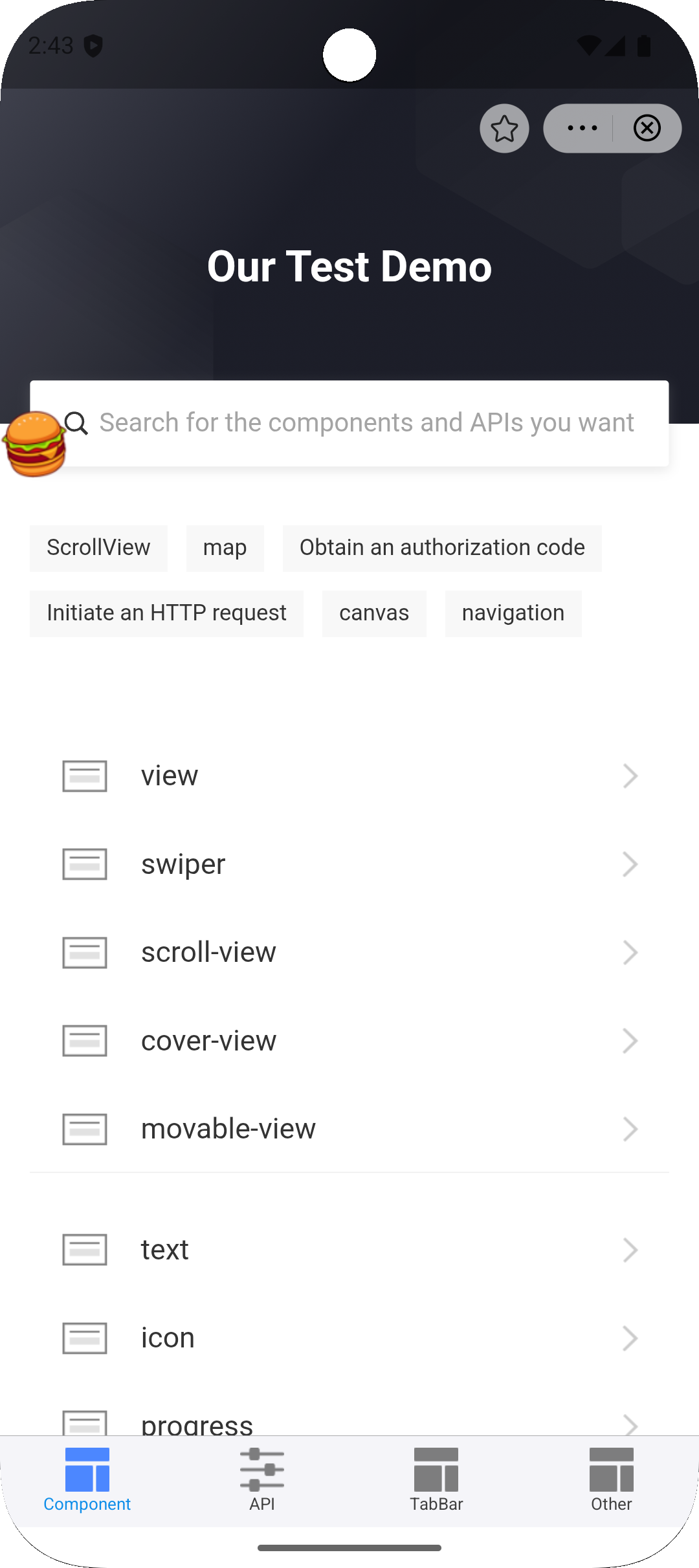
By default, the following buttons on the title bar right-side:
- The favorite/unfavorite button is a star-shaped icon.
- The capsule More and Close buttons are iconfont icons.
Refer to the following UI examples:
Before you begin
To customize the user interface for title bar buttons, ensure that the integrated iOS IAPMiniProgram SDK meets the following version requirements:
- Favorite/unfavorite button: SDK 2.65.3 or later.
- Capsule More/Close buttons: SDK 2.79.0 or later.
For more information, see SDK release notes.
Procedure
To customize the title bar right-side buttons, take the following two steps:
Step 1: Implement the TitleBarInfoExtension interface
Define a class that implements the TitleBarInfoExtension interface. Within the class, implement the getTitleBarItemInfo method to customize the title bar button. Refer to the following code for a sample implementation. For more information about the interface and the method, refer to TitleBarInfoExtension.
public class DemoTitleBarInfoExtension implements TitleBarInfoExtension {

    @Override
    public TitleBarItemInfo getTitleBarItemInfo(String type, String status) {
        switch (type) {
            case MenuType.TYPE_COLLECT:
                TitleBarItemInfo collectInfo = new TitleBarItemInfo();
                if (MenuStatus.STATUS_COLLECT_ON.equals(status)) {
                    // Favorited state
                    collectInfo.setIconDrawable(R.drawable.collect_on_icon);
                    collectInfo.setIconDrawableNight(R.drawable.collect_on_icon_dark);
                } else {
                    // Unfavorited state
                    collectInfo.setIconDrawable(R.drawable.collect_off_icon);
                    collectInfo.setIconDrawableNight(R.drawable.collect_off_icon_dark);
                }
                return collectInfo;

            case MenuType.TYPE_MORE:
                TitleBarItemInfo moreInfo = new TitleBarItemInfo();
                moreInfo.setIconDrawable(R.drawable.custom_more_icon);
                moreInfo.setIconDrawableNight(R.drawable.custom_more_icon_dark);
                return moreInfo;

            case MenuType.TYPE_CLOSE:
                TitleBarItemInfo closeInfo = new TitleBarItemInfo();
                closeInfo.setIconDrawable(R.drawable.custom_close_icon);
                closeInfo.setIconDrawableNight(R.drawable.custom_close_icon_dark);
                return closeInfo;

            default:
                return null;
        }
    }
}
Step 2: Register the Extension
After initializing the SDK create an instance of TitleBarInfoExtension and register it via Griver.registerExtension(for more, see registerExtension). Refer to the following sample registration code:
IAPConnect.init(application, initConfig, object : InitCallback {
    override fun onSuccess() {
        //···
        Griver.registerExtension(
            GriverExtensionManifest(
                TitleBarInfoExtension::class.java,
                CustomTitleBarInfoExtensionImpl()
            )
        )
    }
})
Step 3: Only for the capsule More/Close buttons
When customizing the capsule More/Close buttons, be aware of the following behavior:
- Rendering mode:
- Custom images: Preserves original pixel colors and is NOT affected by the navigation bar's tintColor. Provide a fully-colored image (not a template mask) to ensure correct appearance across both light and dark navigation bar styles.
- Default icons: Uses iconfont icons, which are affected by the navigation bar's tintColor.
- Default behavior: If
getTitleBarItemInforeturnsnull, the SDK uses the default iconfont icons. Default icons are rendered withsetColorFilterand are affected by the navigation bar's tintColor, automatically adjusting colors based on the theme. - Recommended image size:
- Recommended size: 19dp (approximately 22x22 pt)
- @2x: 38x38 px
- @3x: 57x57 px
Images larger than 19dp are scaled down proportionally without cropping.
Images smaller than 19dp are not scaled up and may appear smaller than the default icon.
- Fallback: If the specified
iconDrawableresource ID is invalid (0), the SDK falls back to the default iconfont icon. - Theme switching: When the navigation bar switches between light and dark mode, the SDK automatically selects:
- Light mode: Uses
iconDrawable - Dark mode: Uses
iconDrawableNight(falls back to iconDrawable if not set)
Structures
TitleBarInfoExtension interface
The TitleBarInfoExtension interface defines a method for the super app to customize the title bar button, which the SDK then calls to render the custom button. Refer to the following code for the interface definition:
public interface TitleBarInfoExtension {

    /**
     * Get custom icon information for title bar buttons
     *
     * @param type   Button type
     * @param status Button status
     * @return TitleBarItemInfo Custom icon information, return null to use default icons
     */
    TitleBarItemInfo getTitleBarItemInfo(String type, String status);
}
Based on the definition, this interface provides the following method:
Method | Description |
getTitleBarItemInfo | Called by the SDK to obtain and render the custom title bar buttons. For more information, refer to |
getTitleBarItemInfo method
Parameters
This method has the following input parameters:
Parameter | Data type | Required | Description |
type | String | Yes | The button type. Valid values are:
|
status | String | Yes | The button status. Valid values are:
|
Return value
The method returns an an instance of TitleBarItemInfo object, which contains the following parameters for the super app to customize these buttons. Return null to use the default icons.
Parameter | Data type | Required | Description |
iconDrawable | Int | Yes | The icon's drawable resource ID for light mode. |
iconDrawableNight | Int | Yes | The icon's drawable resource ID for dark mode. |
TitleBarItemInfo class definiton
public class TitleBarItemInfo {

    /**
     * Constructor
     * @param iconDrawable Icon resource ID for light mode
     */
    public TitleBarItemInfo(int iconDrawable) { ... }

    /**
     * Constructor
     * @param iconDrawable Icon resource ID for light mode
     * @param iconDrawableNight Icon resource ID for dark mode
     */
    public TitleBarItemInfo(int iconDrawable, int iconDrawableNight) { ... }

    /**
     * Get icon resource ID for light mode
     */
    public int getIconDrawable() { ... }

    /**
     * Set icon resource ID for light mode
     */
    public void setIconDrawable(int iconDrawable) { ... }

    /**
     * Get icon resource ID for dark mode
     */
    public int getIconDrawableNight() { ... }

    /**
     * Set icon resource ID for dark mode
     */
    public void setIconDrawableNight(int iconDrawableNight) { ... }
}
The object contains the following properties for the super app to customize the title bar buttons:
Property | Data type | Required | Description |
iconPath | String | Yes | The icon path for light mode. |
darkIconPath | String | Yes | The icon path for dark mode. |
See the following complete code sample as references.
Code sample
The following is a complete example showing how to customize all title bar buttons:
// 1. Implement the extension interface
public class CustomTitleBarExtension implements TitleBarInfoExtension {

    @Override
    public TitleBarItemInfo getTitleBarItemInfo(String type, String status) {
        switch (type) {
            case MenuType.TYPE_COLLECT:
                if (MenuStatus.STATUS_COLLECT_ON.equals(status)) {
                    return new TitleBarItemInfo(
                        R.drawable.ic_collect_on,
                        R.drawable.ic_collect_on_dark
                    );
                } else {
                    return new TitleBarItemInfo(
                        R.drawable.ic_collect_off,
                        R.drawable.ic_collect_off_dark
                    );
                }

            case MenuType.TYPE_MORE:
                return new TitleBarItemInfo(
                    R.drawable.ic_more,
                    R.drawable.ic_more_dark
                );

            case MenuType.TYPE_CLOSE:
                return new TitleBarItemInfo(
                    R.drawable.ic_close,         //iconPath
                    R.drawable.ic_close_dark     //darkIconPath
                );

            default:
                return null;
        }
    }
}

// 2. Register the extension (call after SDK initialization)
Griver.registerExtension(
    new GriverExtensionManifest(
        TitleBarInfoExtension.class,
        new CustomTitleBarExtension()
    )
);